Written by Henry M. Holden
The skies in the 1950s were ruled by the radial piston engine airliners like the Douglas DC-7 and the Lockheed Super Constellation. And although the long-range Boeing 707 and the Douglas DC-8 jets were in production and soon to be enter the market, some airlines felt the need existed for a large, medium range turboprop airliner.
Lockheed began construction of this airliner in December 1955, with two firm orders on the books (one from American Airlines for 35 and the other from Eastern Airlines for 40) In all, 14 airlines U.S and international would order 170 Electras.
On December 6, 1957, the prototype Lockheed Electra flew, two weeks ahead of the initial flight of the Boeing 707.

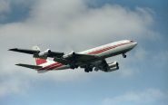
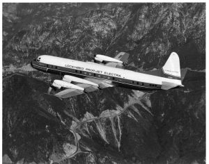
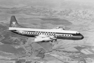
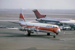
The large exhaust nozzles extended to the trailing edge of the wings and hid much of the wing area. (Author’s collection)
The airplane was the second Electra. In the 1930s Lockheed had built an earlier aircraft named the Electra, a twin-engine aircraft that was over shadowed by the Douglas DC-3.
Eastern Airlines flew the Electra, designated L-188A, on its first revenue flight on January 12, 1959, and American Airlines followed on January 23 of the same year. The L-188C, with increased fuel capacity offered greater range, and went into service later in 1959.

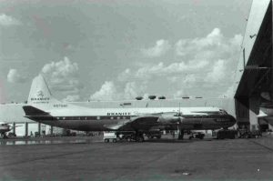
An early Braniff example wearing “Electra II” titles added after completion of the LEAP Program. (Author’s collection)
Behind this new airplane were four years of research and more than $50 million in developmental courses. It had gone through 60,000 hours of wind tunnel tests, and everyone was sure it was the safest and best airplane ever manufactured. But nowhere in the 40,000 miles of blueprints and more than 7,000 mathematical calculations did a phenomenon called “whirl mode” appear.
The Electra looked like a regular airliner, except for the thick, 13-foot propeller blades, and the four large engine nacelles housing the General Electric/Allison 501–314 turboprop engines. The large exhaust nozzles extended to the trailing edge of the wings and hid much of the wing area.
The wings look small and stubby [they were only 5 1/2 feet shorter than the fuselage]. The wide fuselage made it one of the roomiest airliners of its time. Pilots soon got used to its appearance and came to respect the airplane. The Electra had incredible reserve power. One pilot said, “it climbs like a damn fighter plane! “
The Lockheed L-188 had excellent cockpit visibility, improved safety features and it was hailed by many as “a pilots airplane.“ Many airline officials considered the Electra a better all-around airplane then the Boeing 707. According to some, the Electra had more reserve power than any transport aircraft build to date.

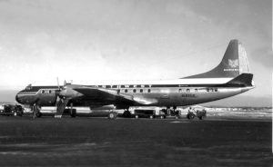
This shot was taken at World Chamberlin Field, Minneapolis in the winter of 1959. N122US had been delivered the previous July and was one of 18 ordered by the airline. On 17 Mar 1960, N121US, NWA’s first Electra was operating a flight from Chicago to Miami when the starboard wing separated over Tell City, Indiana, during violent thunderstorm activity. All 63 passengers and crew were killed. (Author’s collection)
Its safety features were state-of-the-art. For example, there was a single control for an engine fire: One pull feathered the prop, shut off the fuel and oil supply, armed the chemical fire extinguisher and discharged the CO2 bottles all in one-second. On older aircraft these four functions had taken up to 10 seconds.
But the promising new airplane begin killing people. On February 5, 1959, an American Airlines Electra crashed into the East River while on final approach to New York’s LaGuardia Airport. Sixty-five people were killed. Although the crash was eventually attributed to a combination of pilot error, bad weather and an unfamiliar altimeter, the crash stained the Electra’s reputation. That stain would soon spread.

The Tell City accident did account for NWA’s decision to hold off delivery of the final eight of its 18 until the modifications could be built into the new aircraft. The airline also went out and replaced the publicity shots it had had of N121US with ones showing the last of the first batch, N130US seen here. (Author’s collection)
It was September 29, 1959. Six crew members and 28 passengers, on Braniff Flight 542, from Houston to New York, were relaxing in the new Electra. It was a few minutes after 12 midnight, and a farmer in the rural town of Buffalo, Texas, had just shut off his TV. Suddenly, the sky outside his home turned an eerie yellow, and there was a continuous roar. The farmer and his wife ran out to the pasture, where they encountered small shards of aluminum raining down on them. His wife remarked it was raining.
But it wasn’t raining; it was aircraft fuel. When the farmer shown a flashlight into a tree he could see a large chunk of metal. On it were the words “Fly Braniff.“ What caused this brand-new airplane to disintegrate over Buffalo, Texas?
It was March 17, 1960, and the CAA was still piecing together the tragedy when Northwest Airlines flight 710, another Electra, bound from Minneapolis to Miami, made a routine scheduled stop at Chicago. The Electra took off bound for Miami with 56 passengers, 33 men, 23 women, one infant, and six crew. The Electra had settled into a normal flight, cruising above the cloud cover at 18,000 feet. At 1p.m. over Tell City, Indiana, something happened.
Witnesses on the ground heard tearing sounds in the sky. Several saw the thick fuselage of the Electra emerging from the clouds. The entire right wing was missing, and only a stub of the left-wing remained attached to the fuselage.
The airliner seemed to float for a while, according to some witnesses, defying the laws of gravity. But then it dipped, driving straight down, trailing white smoke and pieces of aircraft. It telescoped into a soybean field at an estimated 618 mph. The aircraft disintegrated on impact, creating a smoking hole that was 60 feet deep. There were no bodies. Rescuers found nothing at the impact site except scraps of metal that were not much larger than a spoon. But 11,000 feet away they found the left wing.
This was, beyond alarming. In a period of less than six months, two brand new Electras lost their wings and disintegrated with much loss of life. Could it have been severe clear-air turbulence (CAT) or was there something drastically wrong with these airliners? One week earlier the airframe, with only 1800 hours had undergone a major inspection. The captain, Edgar E. LaParle had 27,523 hours in his logbook. What had gone wrong?
Meetings were held with the recently formed FAA, which was at the time headed by Elwood R. “Pete” Quesada, the legendary Air Force general, pilot, and aviation authority. The ensuing crisis was fueled by rumor and innuendo, and Quesada was on the hot seat. When he hesitated to ground the L-188 some said it was because of a former employee relationship he had with the manufacturer. Quesada’s actions and inactions would become as controversial as the L-188 itself.
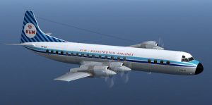
Pressure to ground the airplane mounted quickly, and the flying public avoided the 96 Electras already flying (only one European airline, KLM, initially operated the type). The airline experience up to a 35-percent dip in the loads on the aircraft, a catastrophic loss of revenue in an industry where a 10-percent decrease is damaging.
But the Braniff Electra had not disintegrated, and the painful reconstruction had begun. And as they pieced together the wreckage, a clue emerged. It was something alarming. Shards of what appeared to be the left wing were found some distance from the rest of the wreckage. Could this tragedy have been caused by a severe clear air turbulence (CAT)?
The public had lost faith in the Electras and the media was calling for the FAA to ground the airplane, and the sick jokes didn’t help.
“I’d like a ticket on the Electra to New York!” The passenger reportedly said to the ticket agent.
“We don’t sell Electra tickets; we sell chances,” the agent answered, according to the story. And then there was the Eastern AirLines Electra where flight attendants were reportedly wearing phony stewardess wings with the wings broken off. Or National Airlines: “Look Ma, No Wings!” Electra service to Miami.

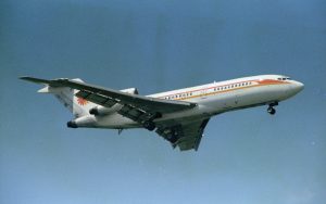
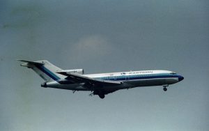
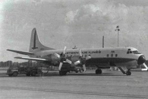
N5514 delivered to Eastern Air Lines on February 13, 1959 went through more than eight owners before beings scrapped in March 1979. (Author’s collection)
All tests seem to indicate the Electra was basically safe and airworthy at slow speeds. Three days after that Tell City crash, the Feds instead of grounding the Electras, ordered the Electras not to fly more than 275 knots (316 mph).slowed down to the speed of a Connie or a DC-6. The representatives from the from the Northwest accident investigation team reminded the FAA that 275 knots is the speed at which the Braniff Electra was flying when it broke up. The FAA then reduced its top speed to 225 knots (259 mph). The speed restriction was arbitrary and imposed to give the public more confidence in the airplane. But it didn’t.

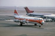
It would be an economic disaster to ground the whole Electra fleet. PSA, for example at the time had only four airplanes in its fleet, all Electras. It was an admittedly risky gamble, but the FAA allowed the Electra to fly, but at a much slower speed.
Passenger still hesitated to get on these “flying cylinders of death” as some call them. The airlines tried to get around the bad publicity. Eastern advertised it’s “Golden Falcon Service” and National Airlines advertised its “Jet Powered Service.”
Meanwhile, the investigations continued. Boeing volunteered staff and simulators to Lockheed. Douglas contributed engineers and equipment. The investigation, occurring in the early 1960s, was the first serious use of computer stress analysis in the field. NASA attempted to re-create the conditions in its wind tunnel.
The Electras were flown in every possible form of turbulence. Test pilots rammed it through the Sierra Madre Mountain’s airwaves over and over again. The Electras were put through every possible flight maneuver that may cause a wing failure. Still nothing!

Only one European airline, KLM, initially operated the type. (Author’s collection)
Basically, the problem was a high speed aircraft in a conventional design. The Electra’s powerplants were housed in four enormous engine nacelles protruding far forward of the straight stubby wing. It was the two outboard engines that were involved in the Electra’s destruction.
Then in May 1960, NASA announced the cause of the accident that took 97 lives. Wing vibration, or flutter, is inherent in the design and is expected. In engineering terms, there are more than 100 different types of flutter, or “modes”, in which metal can vibrate. The mode that destroyed the Electra’s wing was called a whirl mode.
Whirl mode was not new, nor was it a mysterious phenomenon. Its a form of vibration inherent in rotating machinery such as oil drills, table fans and an automobile’s driveshaft.
The theory was devastating simple. A propeller has gyroscopic tendencies. Engine turbines spin at 13,820 rpm and the propellers at 1,280 rpm. These forces are designed to stay in a smooth moving plain of rotation unless displaced by a strong external force, (just as a spinning top can be made to wobble if a finger is placed against it).

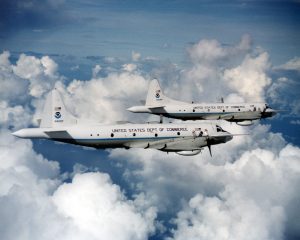
An early livery on the Department of Commerce P-3 Orion. (Author’s collection)
Now suppose a force drives the propeller upward. The stiffness that’s part of the nacelle’s structure promptly resists the force in a downward motion. The propeller continues to move in one direction, but the rapidly developing whirl mode is vibrating in the opposite direction. The moment such a force is applied to an engine, it starts a chain reaction. The propellers normal plane rotation is disturbed, sending inharmonious forces back to the wing. The result, if not checked, is a wobbling effect that begins to transmit its motion to a natural outlet: the wing. The wing now begins to flex and flutter, sending discordant forces back to the engine-prop package, which in turn creates more and violent vibrations, feeding the mode new energy. It took less than 30 seconds for the energy to separate the wing.
Whirl mode did occasionally develop in propeller-driven airlines. It was always encountered by the powerful stiffness of the entire package, the nacelles in the engine mounting, and the truss holding the engine to the wing. This usually isn’t a problem. But on examination of the Electras engines, investigators found that something caused the engine loosen and wobble causing a severe whirl mode.
Investigators discovered that the engine mounts weren’t strong enough to damp the whirl mode that originated in the outboard engine nacelle. The oscillation transmitted to the wing caused severe up-and-down vibration, which increased until the wings separated.
On the Braniff Electra, they discovered an over speeding prop that produced a particular sound. When a tape of the sound was played to the crash witnesses they verified the sound. Examination of the wreckage found loose and wobbly prop on the left wing’s outboard engine. The world mode caused from the over speeding prop was unchecked by the engine mount.
The lucky few who deplaned the Northwest Electra in Chicago told investigators about experiencing a “hard landing.” Tell City had reported CAT. Investigators concluded that the combination of the hard landing and the CAT weakened in the Electras outboard engine mounts. When the pilot tried to pull up and compensate for the turbulence a whirl mode followed, tearing off the already weakened wings.
Lockheed began a retrofit program called LEAP (Lockheed Electra Adaptation Program). All Electras had their wings strengthened, the engine nacelles reinforced and mount, which was ordinarily a bar, redesign to a strong “V”-shaped to withstand more stress.
Electras took to the skies with restored confidence. And then on October 3, 1960, an Eastern Airlines Electra departing Boston for New York, crashed, killing all 72 aboard. Again, a cry went up to ground Electras but this crash was different. A large number of English starlings had been ingested into the Electra’s wide engine intakes. This caused the engines to flame out. The plane lost lift stalled and fell into Boston Bay. Although this problem was serious for all airliners it wasn’t associated with the Electra’s design.
But there were more Electra crashes. On September 14, 1960, an American Airlines Electra landing at LaGuardia airport tore across the Grand Central Parkway where it came to a stop, upside down. Miraculously all aboard survived. Then on September 17, 1961, another Northwest Electra crash near Chicago, killing 37 people.
Neither crash was the result of a design or structural flaw. The first involved excessive landing speed and a skid; the second caused by an improperly placed aileron cable.
The majority of the Electras were retired from the major airlines by 1975, but Eastern Air Line’s retired the last one on November 1, 1977. Today the remaining Electras continue as services charters, sprayers and freighters.
In 1958, the U.S. Navy replaced their aging fleet Neptune anti-submarine warfare and maritime patrol aircraft with the Lockheed P-3 Orion. Name for the winter constellation of the mighty hunter, the Orion was retrofitted from the Lockheed Electra.

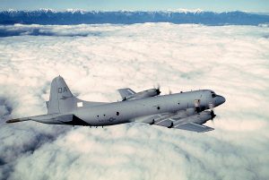
A U.S. Navy “slick” version of the P-3 Orion. (Author’s collection)
The initial P-3 was modified from the third Electra airframe. While based on the same design philosophy as the Lockheed L-188 Electra, the aircraft was structurally different with seven feet (2.1m) less fuselage forward of the wings and military additions such as wing hard points, nose radome and a distinctive tail “stinger” for detection of submarines by magnetic anomaly detector.
The Navy still flies the P-3 Orion over the long-range landplane and the antisubmarine platform.
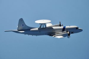
In June 1988, the U.S. Customs Service welcomed to first three Airborne Early Warning aircraft (AEW) into its fleet. They use it as a long-range radar detection platform to perform on the southern U.S. border, Gulf of Mexico and the Caribbean. The aircraft is a distinctive 24-foot diameter rotodome fuselage. It is coupled with an APS-138 radar system. The Customs P-3 also comes in a second variant without the dome (Slick). The dome can detect targets over land and water in an encompassing 196,250 mi.² per 360° sweep. It can remain airborne for up to 14 hours.
According to Robert Sterling, author of “The Electra Story” Lockheed had made the decision to close the production line March 17, 1960 – just hours before the Tell City crash. Sales had dried up because airlines decided to wait for the short haul pure jets on the drawing board. Once the BAC-111, 727 and DC-9 went into service passengers didn’t want anything to do with props.
The two publicized in-flight breakups in the first 16 months of service – Sept 1959 and March 1960 – gave the plane a similar ‘reputation’ as the Comet, the Electra was in trouble. Initially it did not sell well overseas. There was strong competition for turbo prop airliners from several manufacturers.

A U.S. Customs P-3 “dome’ This photo shows the insignia on the tail of the Department of Homeland Security, formed after September 11, 2001. (Author’s collection)
Lockheed shut down the assembly line after only 170 airframes completed with huge losses, estimated at over $50 million. Production ended in 1961, just three years after introduction.
According to the Lockheed L-188 Electra Wikipedia.org site, the Electras went on to fly for more than 29 different airlines as freight dogs, sprayers and charters for decades.
On September22, 1978, a U.S. Navy P-3B Orion msn 185-5199 registration 152757 went down because of a suspected whirl mode. It is the only military Orion lost to the phenomenon known as whirl mode.
[printicon align=”left”]
