The Soaring Sixties: Airline Marketing in Changing Times

Written by Shea Oakley
The tumultuous decade of the 1960’s is best remembered as a time of great change in the social fabric of the United States. Among the institutions radically altered by this troubled yet dynamic era was “Corporate America,” of which the airlines were no exception. As with other industries, air carriers emerged at the end of this period quite unlike their former selves a mere decade before. There is, perhaps, no better way to track these changes than by examining the corporate image-making and print advertising that embodied the marketing of the domestic airlines in “the Soaring Sixties.”
At the opening of the decade, the “Jet Age” was still dawning. As each airline introduced more of the swift, new, pure-jets, impressive color ads would invariably accompany them, extolling the airplane’s virtues. What is notable about the marketing of this time is that the airlines were not just trying to sell speed or smoothness of flight, but confidence in the minds of their customers. In today’s era of wide-bodies and regional jets, it is easy to forget that in 1960 the jetliner was a completely new and somewhat frightening machine for passengers accustomed to large propellers spinning outside their windows and pulling them through the air. However such fears rarely lasted beyond a person’s first flight in these new giants. In 1958 Pan American had become the first American airline to put a jetliner, the Boeing 707-121, into service. Glowing descriptions of these “Jet Clippers” soon inspired international travelers to flock from the company’s piston-equipped competitors. Contemporary Pan Am ads showed the aircraft soaring high above the clouds and oceans, purposefully angled in such a way as to accentuate the sharply swept-back wings and sleek jet-engine pods. This sort of graphic profile soon became the norm in several other airlines’ introductory jetliner advertisements.
Pan Am’s principal American competitor, Trans World Airlines (TWA) had to wait over a year before it could acquire its own jets. In the meantime TWA was able to lease a single 707 to start transcontinental service in earnest. In 1961, when TWA began receiving fan-jet powered 707-131B’s and 331B’s, it introduced a new class name for them: “StarStream.” The Boeings were soon complemented by slightly faster, but smaller Convair 880’s for medium-range services. Both aircraft wore their StarStream titles just aft of the characteristic TWA red arrow window stripe. The word “StarStream” seemed to connote all the cool elegance of the Jet Age. The slogan “Route of the Starstream Fleet” was created and soon found its way into much of TWA’s advertising in the early to mid-Sixties.
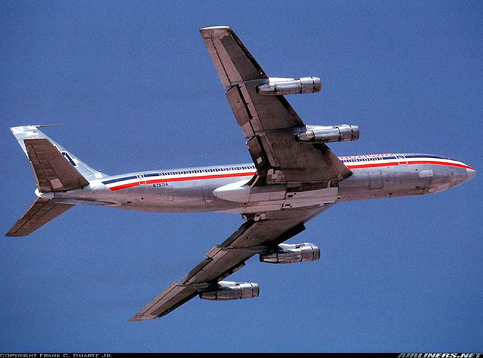
Throughout most of the decade American Airlines billed itself as “America’s Leading Airline.” A cornerstone of this claim were their famous “Astrojets,” Boeing 707-123B’s, 720B’s and Convair 990’s that boasted a new class of jet engine, the turbo-fan, introduced in 1961. These power plants were about 30% more powerful than the earlier, straight turbo-jets which they often replaced. Turbo-fans allowed for shorter take-off and landings as well as slightly faster cruising speeds. American was the first U.S. carrier to re-engine its entire fleet with these fans and with them came the Astrojet moniker. Many other airlines promoted new names for similarly-equipped aircraft as they came on-line, but none of them garnered the same public recognition as the Astrojet. For much of the Sixties almost every American Airlines ad mentioned the Astrojet somewhere in its copy along with the slogan “America’s leading Airline.”
Eastern Air Lines was somewhat of a latecomer in regards to jets. Eastern’s Douglas DC-8-21’s were delivered well after most other carriers had introduced their own jetliners and its Boeing 720’s came even later. However, once EAL had the airplanes they were lavishly promoted, especially in the case of the DC-8. Eastern introduced the both the DC-8’s and 720’s as “Golden Falcon Jets.” The “DC-8B Golden Falcon Service” was among the most luxurious of the era and was marked by an in-flight lounge and interior designed by Harley Earl of Cadillac fame. Multi-color spreads described its pleasures in major national magazines like Life and Look. Eastern’s most memorable early-Sixties slogan was introduced somewhat later: “The Nation’s Most Progressive Airline.”
Tiny but aggressive National was the first domestic carrier to begin pure jet service, in December 1958, with leased Pan Am 707’s. By 1960 “The Airline of the Stars” had its own DC-8’s. The aircraft was promoted as “The Brightest Star on the Airline of the Stars.” This slogan was dropped in late 1962 and replaced first with “National goes where the nation grows” and a few years later by “Coast to Coast to Coast.”
Dallas-based Braniff International Airways purchased a special variant of the 707, the –227, with higher performance turbo-jet engines. Named “El Dorado Super Jet’s,” these were among the world’s fastest airliners throughout the decade. Their chief competitors on Texas routes were Delta’s Convair 880’s and, later, American’s Convair 990’s. None of these three aircraft were particularly profitable to operate, however, due to their high specific fuel consumption. A more important aspect of Braniff’s advertising during the early 1960’s was its stress on new jet service for South American routes as well as on-time performance. Additionally the airline took delivery of BAC One-Eleven’s for short to medium range services. They were known as “Fastback Jets,” referring to the swift football players. The One-Eleven’s were much more efficient on these types of segments than larger airplanes like the Boeing 720 and the Convair’s.
No discussion of how airlines introduced their jets would be complete without mention of United Air Lines. UAL took the already established “Mainliner” aircraft designation and added “DC-8 Jet” to make “DC-8 Jet Mainliner.” The red, white and blue Douglas’s were advertised with much talk of their “vibrationless flight,” always a sore point with the old prop-liners.
The smaller local-service carriers took special pride in their jet equipment when they received them a few years after the majors. A good example was Mohawk Airline’s “Upstart!” ads featuring the new BAC One-Eleven climbing skyward. Ozark Airlines talked often of “Jet-Power” in marketing its Douglas DC-9-14’s during the mid-sixties under the slogan “Go-Getters Go Ozark”. The regionals of the time might have been late in receiving pure-jets, but they made the most of what they had once they got it.
As the initial fascination associated with jets began to wear off, the airlines started to look for other ways to get their share of the era’s soaring traffic. Starting in the middle of the decade advertising began to promote new concepts in service including novel seating configurations and in-flight entertainment systems that were coming on line with the “trunk” carriers. While the colors and artwork were similar to that of the early-sixties, the emphasis began to change.
Normally conservative United led the way with two different service experiments in as many years. The first came in 1963 when the airline introduced single-class 5-abreast “Red Carpet Service” on transcontinental routes in DC-8s built for 6-abreast seating in coach and 4-abreast in first class. This egalitarian approach was a flop, however, and was soon replaced in 1965 by a 3-class layout consisting of 4, 5 and 6 across seating. This service, also called “Red Carpet,” failed as well. Both services had been hawked by glossy red, white and blue ads in national magazines, but these did not seem to help them catch on.
A much more successful enterprise was in-flight entertainment or, more simply stated, movies. TWA led the industry in 1961 making first-run films part of its new “Royal Ambassador” coast-to-coast service. United introduced “Jetarama Theater” in 1964. Around the same time American launched its own unique system called “Astrovision” which put movies on television screens dispersed throughout the cabin. Later American renamed an updated system “Astrocolor” which continued to be used into the Seventies.
As the U.S. carriers entered the middle of the decade there seemed to be a need for a new visual image. With the ongoing phase-out of the last propeller-driven equipment, the airlines began to think about adopting a new look and feel more suited to the awe-inspiring “jumbo-jets” and supersonic transports (SST’s) which were projected to begin entering service around the end of the decade. Airline historian R.E.G Davies put it this way in his Airlines of the United States Since 1914:
“In the 1960’s most of the major companies went through the (new image) process once again, with special emphasis on extravagant paint schemes to identify their new jet fleets, as a way of obliterating memories of the prosaic piston-engine past.”
While the liveries of aircraft were the most obvious indicator of this image makeover, they were not the only things to change. Advertising became much bolder, and in some cases almost esoteric. The colors were brighter, the prose more purple, and the message perhaps more enticing than ever before or since. A large part of this new approach to public image was related to what was going on in America at that point in our history. The late-sixties were, after all, an almost unreal time of outrageous philosophies, fashions, music and lifestyles. The “high”-flying airlines simply began to reflect the times, along with many other consumer-oriented American businesses.
As mentioned, the first sign of change the airlines underwent concerned aircraft exterior color schemes. Most domestic carriers introduced streamlined and/or brightly hued new looks. If a company was seen as having a stodgy or outmoded image, such highly visible schemes could transform it into a perceived trendsetter almost overnight. Along with the revised look there was often a new class-name for jetliners. The traveler of the late-sixties could ride in Funjets, Arrowjets, Whisperjets, Pamperjets, Fiestajets, and Vistajets. Perhaps never before had flying seemed like so much fun.
Braniff was one of the first airlines to introduce a radically revised paint job, one that was arguably the most radical of all. In 1965 noted designer Alexander Girard created innovative aircraft exteriors and interiors. The fuselages of the entire fleet were repainted in several solid pastel hues with names like “Periwinkle blue” and “Ochre” while the wings, tail and engines were finished in solid white. Cabins received similar color treatments and the stewardesses who graced them wore flamboyant uniforms by Emilio Pucci. Braniff’s new slogan “The End of the Plain Plane” aptly described the changes that were about to take place throughout much of the industry.
Once almost sedate Eastern Air Lines now employed the avant garde New York design firm of Lippincott and Margulies to redesign its corporate image. The result was the “New Mark” scheme, one of the more attractive liveries of the period. Eastern aircraft received two-tone stripes in “Ionosphere” and “Caribbean” blue that swept up the tail to form a sort of “hockey stick.” The engine nacelles on new Boeing 727’s and Douglas DC-9’s were also painted in these colors with the top of the fuselage a bright white. The Eastern falcon logo was revamped with a simple, streamlined design. The above-mentioned rear-engined equipment was given the class-name, “Whisperjet” to promote their relatively low interior noise level. Towards the end of 1969 the airline introduced one of the most memorable U.S. ad campaigns of all time, “The Wings of Man,” conceived by agency Young and Rubicam. This would be EAL’s slogan for nearly 10 years. The ads focused on the more ethereal aspect of flight as evidenced in this ad copy from December of 1969:
“Come.
We will be your wings. We will set you free.
Free beyond the heights of man. Free
To chase the sun.
Hug a cloud.
And, though you were born on earth.
To live on earth. You will be
At home, here in the sky.
The comfort and ease you own on
Earth, you will have up here.
And, Eastern will make it so.
It shall be a most natural
Thing. For you. To fly.
Eastern. The Wings of Man.”
Before the perennially struggling Northeast Airlines was merged into Delta in 1972, it adopted one of the more striking new themes of the late-sixties. Its “Yellowbirds” jet fleet was painted in a vibrant yellow and white. A typical advertisement from 1967 encouraged passengers to “Catch a Yellowbird and Let Luxury Happen to You,” referring to such NEA on board amenities as steak broiled to order and real woolen blankets. Unfortunately Northeast had a dismal earnings record for most of its history which the best visual image in the world would not change.
In late 1967 National Airlines introduced a look that, along with shrewd marketing tactics, kept it competitive in the Northeast-Florida market for a long time. NAL’s aircraft were repainted in orange and yellow, topped off by a stylized sun-god logo called the “Sun King.” Stewardesses received solid orange, lemon and lime-colored uniforms and National’s transformation into “Florida’s Own Airline” was complete. National was able to build this “Instant Florida” image largely just by changing the way it visually presented itself to the flying public. In many ways it was a textbook case of what was happening with domestic carriers during the closing years of the Sixties.
In the West, Continental Airlines introduced Red, Orange, and Gold “competition stripes” and a new logo by Saul Bass. Its “Proud Bird with the Golden Tail” advertisements were among the best-recognized of the era. Employee pride was the main selling point since the company was generally recognized as having higher than average service. Continental was one of the most profitable carriers of the period, largely because of aggressive leadership under its long-time President Robert F. Six.
While Trans World Airlines did not introduce a new look in the late-sixties, it did introduce a great, if short-lived, slogan, “Up, Up, and Away.” This was taken from the title of a popular tune by the group, “The Fifth Dimension.” The slogan was a Wells, Rich and Green suggestion (the ad agency that created “The End of the Plain Plane” campaign for Braniff.) It was during this time that TWA began its “Foreign Accent” flights featuring flight attendants dressed in outfits representing various European countries. TWA was always known as one of the more glamorous airlines in the industry, and this well-deserved reputation continued throughout the decade.
One of the last carriers to affect a change was American Airlines. Its bare metal with Orange lightning-bolt scheme finally gave way in late 1968 to broad, patriotic red, white and blue stripes and a stylized “AA” service mark. The designer was Henry Dreyfuss. Cabin crews were dressed in new “Americana” knit uniforms and the old slogan “America’s Leading Airline” became “Fly the American Way.”
A few companies refused to join the trend and kept their fleets’ liveries as well as their ads more conventional throughout the decade. Pan Am, for instance, retained its 1957 era blue globe logo and “World’s Most Experienced Airline” slogan from 1960 to 1969 when “Pan American” titles were shortened to “Pan Am” on aircraft fuselages, and the ad tagline was finally changed to “Pan Am Makes the Going Great.” Southern-based Delta Air Lines’ ads were usually of the homespun, conservative variety and the famous “Widget” insignia first introduced in the late 1950’s continued for the duration. Both before and at the beginning of “The Friendly Skies” era, United Air Lines image was positively conventional, though the carrier rarely failed to make a profit. The companies’ overwhelming size helped, with over 350 jets in its fleet. But, overall, these cautious approaches were the exception to the rule.
So the watchwords for this dynamic decade were change, innovation, service and image. The airlines mirrored the nation in some of these respects. Yet, once the decade was over, both seemed to settle down into uncomfortable middle age. The Sixties were the last years that America seemed young, and so it was with the airlines of America. Deregulation, oil-crises, fare-wars and terrorism were all, as yet; unknown and the sky literally seemed to be the limit. The vibrancy of the time was palpable and shone through the airline’s marketing.
It was an era never to be repeated.
Trackback from your site.
Mary Hoy
| #
Here’s a tough airline trivia question for you. Which airline used the
tune « Beyond the Blue Horizon « in their radio ads in the 60s? Help me out, please. Thanks!
Reply