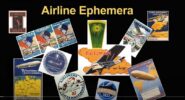
Daniel Kusrow, past editor of the “Labels and Stickers” section for the Captain’s Log, recently gave a video lecture for the American Air Mail Society on the history of airline baggage label collecting.
In the recording, produced by the American Air Mail Society and the Rocky Mountain Philatelic Library, Kusrow covers many aspects of airline ephemera, including airline baggage labels, various other types of labels and posters. You’ll see many stickers from both WAHS and Airliners International.
We invite you to watch Daniel’s in-depth and informative lecture.
What labels, stickers and other ephemera do you collect? Do you have an airline collectibles story to tell? Email captainslog@wahsonline.com for information on how to share your story.
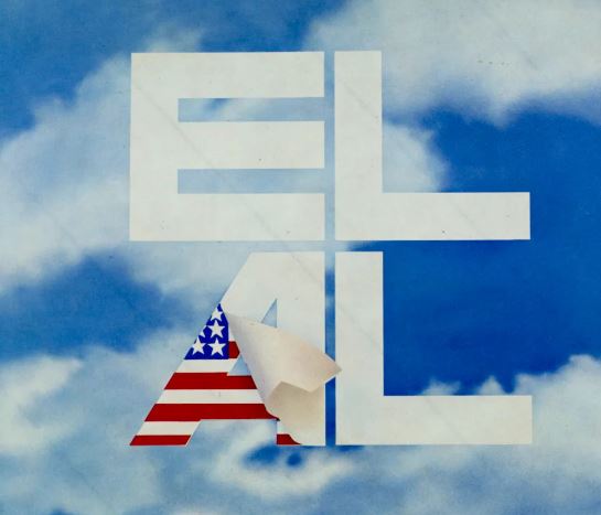
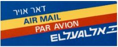
Since EL AL’s first scheduled flight in July 1949, it has issued numerous labels (sometimes called stickers) for promotional and identification purposes. Airline labels appeal to aviation enthusiasts as they form a historical record of the development of an airline’s logos and advertising themes.
I have more than 200 different EL AL labels in my collection, and even more exist. Each has an adhesive side, typically on the back, for placement on baggage, cargo, stationery and other items, while a few have adhesive on the front for affixing to windows. This article features a selection of some of my favorites.
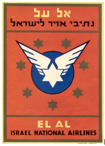
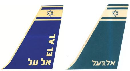
EL AL’s earliest labels feature its first logo: a six-pointed star with added flying wings, designed by the noted Israeli artist, Franz Krausz. The six-pointed star has served as a Jewish symbol for several centuries, and some say it recalls the star symbol on the shield of the most famous Israelite monarch, King David. The star has adorned the tails of each EL AL aircraft since the founding of the airline shortly after the birth of the modern State of Israel in 1948. The logo with added flying wings remained EL AL’s principal logo from 1949 until the creation of the EL AL “block” logo in 1962.
Let’s start with EL AL’s first four non-cargo labels.
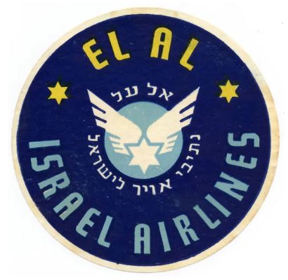
EL AL’s first label, designed by Israeli artist Franz Krausz, 1949. 9.7cm. diameter. This beautiful label is still surprisingly common today and can be obtained on eBay at a relatively low price. Reproductions of this label (and of the next two shown) are also being sold, so if you want an original, check the description carefully.
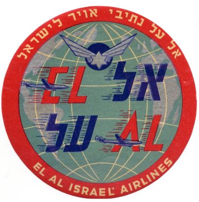
EL AL’s second label, 1951, features its third aircraft type, a Lockheed Constellation (its first two types being the Douglas DC-4 Skymaster and Curtiss C-46 Commando). Designed by Franz Krausz. 10cm. diameter. This label is still fairly common, but less common than the first one.
EL AL’s third label and its first vertical one, early 1950s. Designed by Franz Krausz. 9cm. width x 12cm height. There are two printings of this label, with different type fonts and wing details. The one shown is by Artone Press and is uncommon. The other printing is by Rand Litho and is fairly common.
EL AL’s fourth label not designed expressly for cargo. 12x8cm. Uncommon.
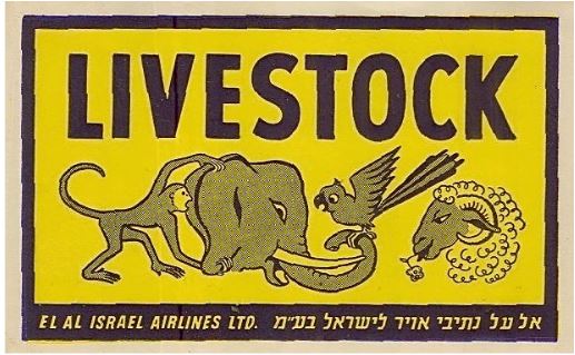
EL AL started all-cargo flights in 1950 and introduced several cargo label types to give special handling instructions and to identify cargo destinations.
In the early 1950s EL AL issued its first set of special instruction cargo labels, each with the same typeface of “EL AL” on the bottom. This one was placed on containers holding animals. 13.8×8.5cm. Other such labels stated “Danger. Do not load in passenger planes”; “Must Ride. Do not offload on route”; ‘Fragile”; and “With Care”. Each is very uncommon.
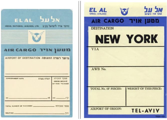
On the left is the style of EL AL’s first cargo destination label. Early 1950s. The destination would be filled in by a printed stamp or handwriting. 10.2x14cm. Very uncommon. On the right is the style of EL AL’s cargo destination label that replaced the left one later in the 1950s and into the 1960s. 10.2×14.5cm. These have the destination pre-printed. I have 17 different destinations in this set – Amsterdam, Athens, Cologne, “Diseldorf”, Geneve, Hamburg, Istanbul, Johannesburg, London, Munich, New York, Nicosia, Paris, Rome, Teheran, Vienna and Zurich — and there probably are more. Uncommon.
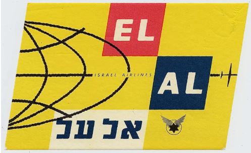
In 1961 ELAL introduced Boeing 707s to its fleet and issued the left label in the shape of an EL AL 707 tail. 6.2×8.3cm. In 1962 Otto Treuman of the Netherlands and George Him, EL AL’s design consultant, created a new block logo for EL AL that became its principal logo, and soon thereafter EL AL revised its 707 tail label to include the block logo as seen on the right. The left label is uncommon. The right one was included in seat packets in-flight and is more common.
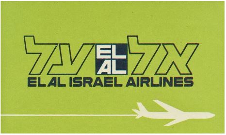
In 1963 EL AL’s design consultant George Him created a logo that placed the EL AL block between the words ‘”EL AL” in Hebrew (read right to left). This label shows that logo with an outline of a 707, EL AL’s main aircraft type at the time. An identical label exists with a mint green background. 11.5×7.3cm. Uncommon.
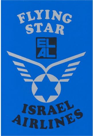
About 1965 George Him modified the original EL AL flying star logo, giving it a more modern look. His revision appears on this label, along with the EL AL block logo introduced in 1962. This label was issued in at least three background colors, blue, white and red, and a similar label issued after 1970 also shows an EL AL 747. 6.5×11.5cm. Very uncommon.
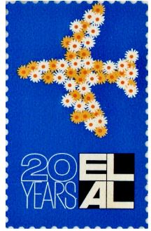
In 1969, for its 20th anniversary, EL AL issued its ‘flower plane’ designed by ADVICO of Zurich with artwork by Ruedi Külling. It appears on this label as well as on EL AL desktop and wall posters. 2.5x4cm. Uncommon.
EL AL label publicizing service to the United States. Probably issued in the 1970s. Similar to a series of EL AL destination posters designed in the late 1960s by noted Israeli artist Dan Reisinger, where one of the letters in “EL AL” is transformed into a symbol of the destination. This label also was issued in poster form. 18×15.5cm. Very uncommon.
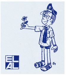
Several EL AL memorabilia, including this label, feature the Israeli character “Srulik,” created by the Israeli illustrator Kariel Gardosh, known as “Dosh.” Here Srulik. as an EL AL Captain, offers a flower welcoming visitors to Israel. Probably issued in the 1970s. 4×4.5cm. Uncommon.
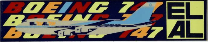
The Boeing 747 entered EL AL’s fleet in 1971, and the airline issued this label featuring a 747 bearing the EL AL “linear” logo designed by Israeli artist Dan Reisinger. 25x5cm. The “linear” logo intertwines the English and Hebrew words for EL AL using the typefaces of the separate English and Hebrew block logos. The overall label design was created by Israeli artist Effi Ryvkind. This label also exists with Hebrew text and no 747 aircraft, and another variation was issued as a poster. Very uncommon.
Two EL AL labels issued in the 1970s with a play on words based on phrases from the Bible. 37.5×9.5cm. and 37.5x9cm. Very uncommon.
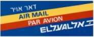
EL AL airmail etiquette probably issued in the 1970s. This is the only EL AL airmail sticker that I know of. 5x2cm. Fairly common.
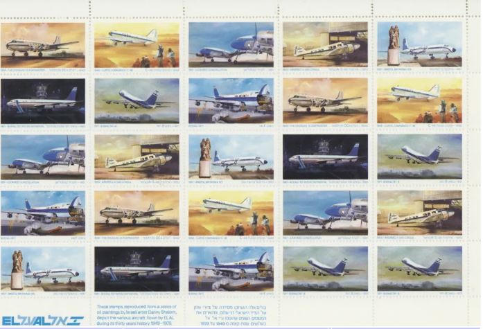
Sheet of EL AL aircraft labels issued in 1979, with artwork by Israeli artist Danny Shalom. These scenes were also produced in postcard and poster form. Each label is 4×2.2cm. Fairly common.
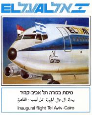
Label publicizing EL AL’s inaugural flight to Cairo, March 1980. 8.3×10.3cm. Fairly common.
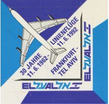
Label honoring 30 years of EL AL service between Tel Aviv and Frankfurt, June 11, 1992. 5x5cm. Uncommon.
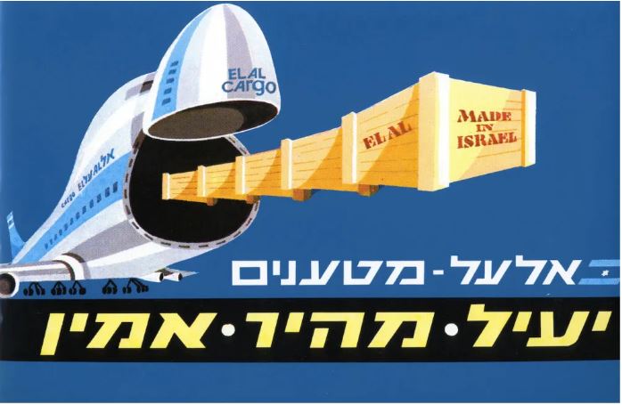
EL AL cargo label featuring one of its open-nose 747-200 freighters. The Hebrew text says “EL AL – Cargo” and “Efficient. Fast. Reliable.” Probably issued in the 1980s. Another version of this label exists with different Hebrew text. 32.8×23.2m. Very uncommon.
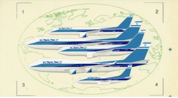
Label issued in 1988/89 with EL AL’s 40th-anniversary logo. It features the four aircraft types in EL AL’s fleet at the time, the Boeing 757, 747, 767 and 737, each a -200 series. The label also exists without the 40th-anniversary logo, and both variants were also issued in see-through form with adhesive on the front for affixing to windows. 22.5x9cm. Each variation is common.
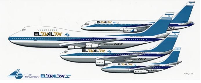
With the arrival of Boeing 747-400s in EL AL’s fleet in 1994, EL AL revised its aircraft fleet label to show its five aircraft types at the time, all Boeing: 757-200, 747-200, 767-200, 747-400 and 737-200. This label also shows that EL AL slightly modified its aircraft livery by changing the colors of the EL AL name from black and gold to light blue and dark blue, and by having the cheatline on all its 747s come to a point near the nose to conform with that change already introduced on its other aircraft types. 19.7×12.4cm. Fairly common.
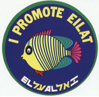
At various times EL AL has served Eilat, the Israeli resort town at the southern tip of the country by the Red Sea, in either domestic or international flights. This label promoting Eilat was probably issued in the early 2000s. 10cm. diameter. Uncommon.
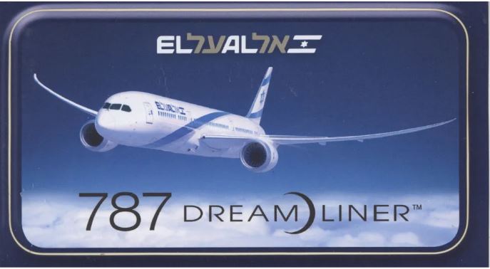
This label publicizes EL AL’s Boeing 787 Dreamliners, introduced In 2017 and serving as its main long-haul aircraft type. The 787 has EL AL’s blue and silver ribbons livery, first introduced in 1999 during EL AL’s 50th anniversary. Note also that the EL AL linear logo on this label has different typography, a change made by EL AL in 2006 and in continuous use since then. This label also exists in a see-through form for application to windows. 13.7x8cm. Issued in 2017. Uncommon.
In 2018 EL AL started promoting its proposed new nonstop route from Tel Aviv to Tokyo, originally set to start at the beginning of 2020, and this label was part of that promotion. The new route was postponed due to the Covid-19 pandemic. The airline now plans to start flights to Tokyo in 2023. The Hebrew text in this label says: “New! Direct Flights to Tokyo”. 20×9.7cm. Uncommon.
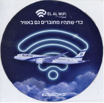
This label announces the availability of Wi-Fi on all of EL AL’s 787 Dreamliner aircraft. The Hebrew text says: “So you will also be connected in the air.” Issued in 2018. 11.8cm. diameter. Uncommon.
Article text copyright 2023, Marvin G. Goldman. All images from the author’s collection.
It is no secret that I am enamored of all things related to commercial aviation. Back in May of 2013, I wrote about U.S envelopes preprinted to indicate airmail service. I ask your indulgence if I show some more, this time adding foreign ones. They speak for themselves and I will let them do that after a few brief comments.
The designs seem to fall into three basic categories: hand-drawn, those made by airline companies and those either generic or specific to a non-airline company.
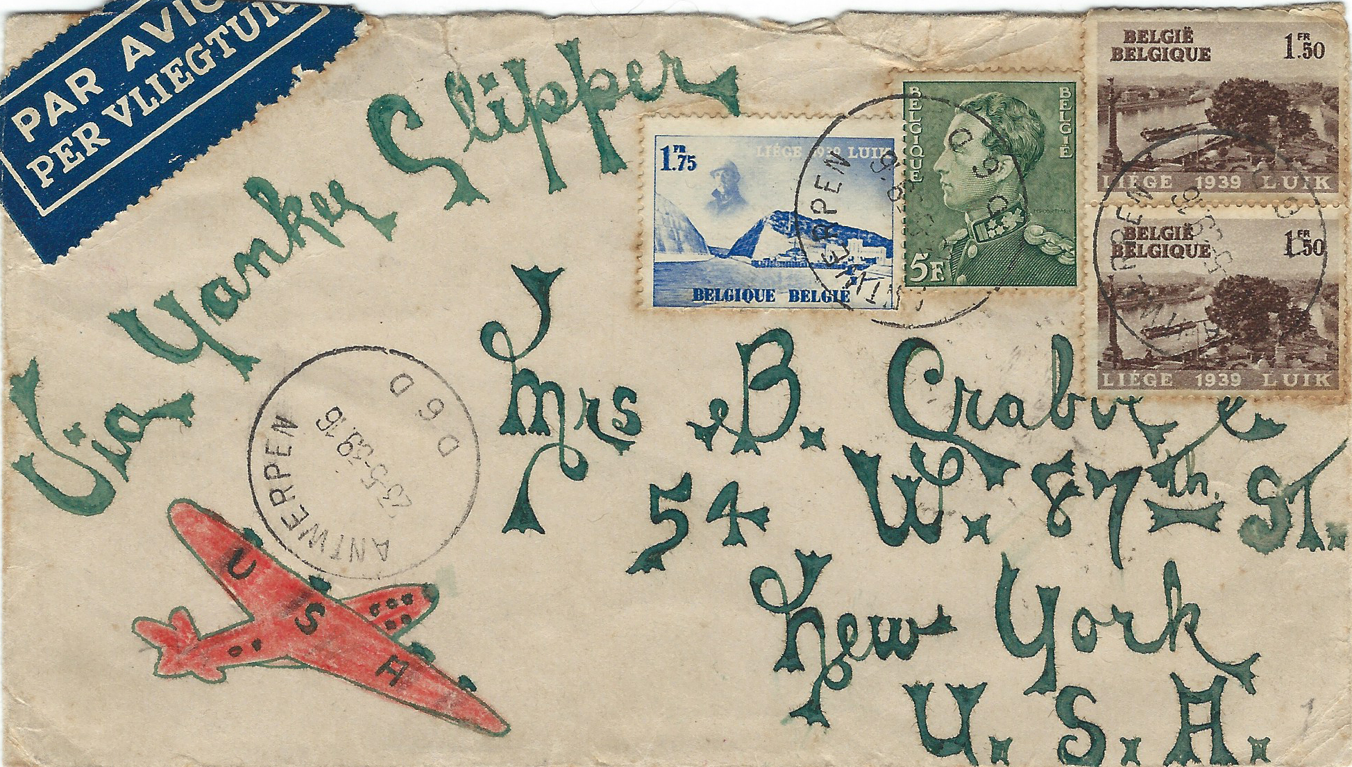
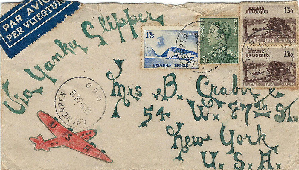
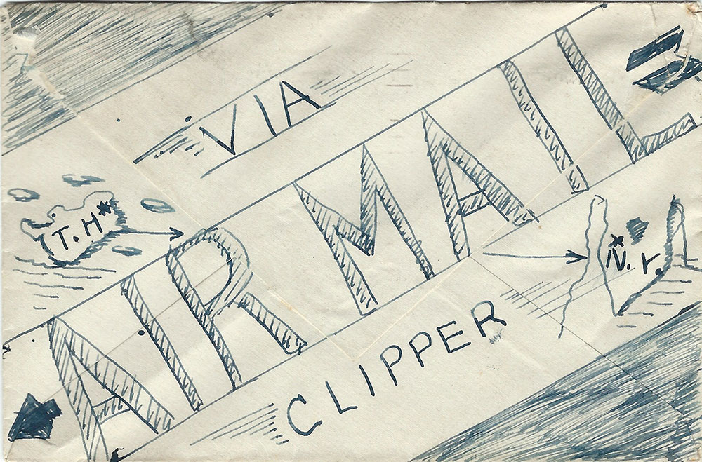
Hand-drawn ones have a charm all their own. They are usually made for non-philatelic purposes, manifesting the sender’s imagination. They are direct descendants of the 19th century British pen and ink covers (whose artistry is usually quite a bit more evident). The 1939 cover was carried from Belgium on the first flight from France to the U.S. The use of an air etiquette to help define the shape of the drawing shows some design sense. First flight covers rarely have such flamboyance. (Figures 1a&b)
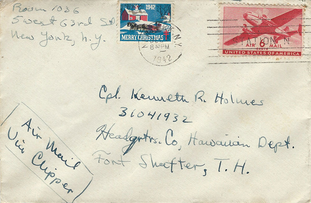
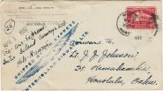
Cpl. Holmes, stationed at Hawaii, received a rather striking cover from New York. It even has a tied-on Christmas seal. (Figures 2a&b)
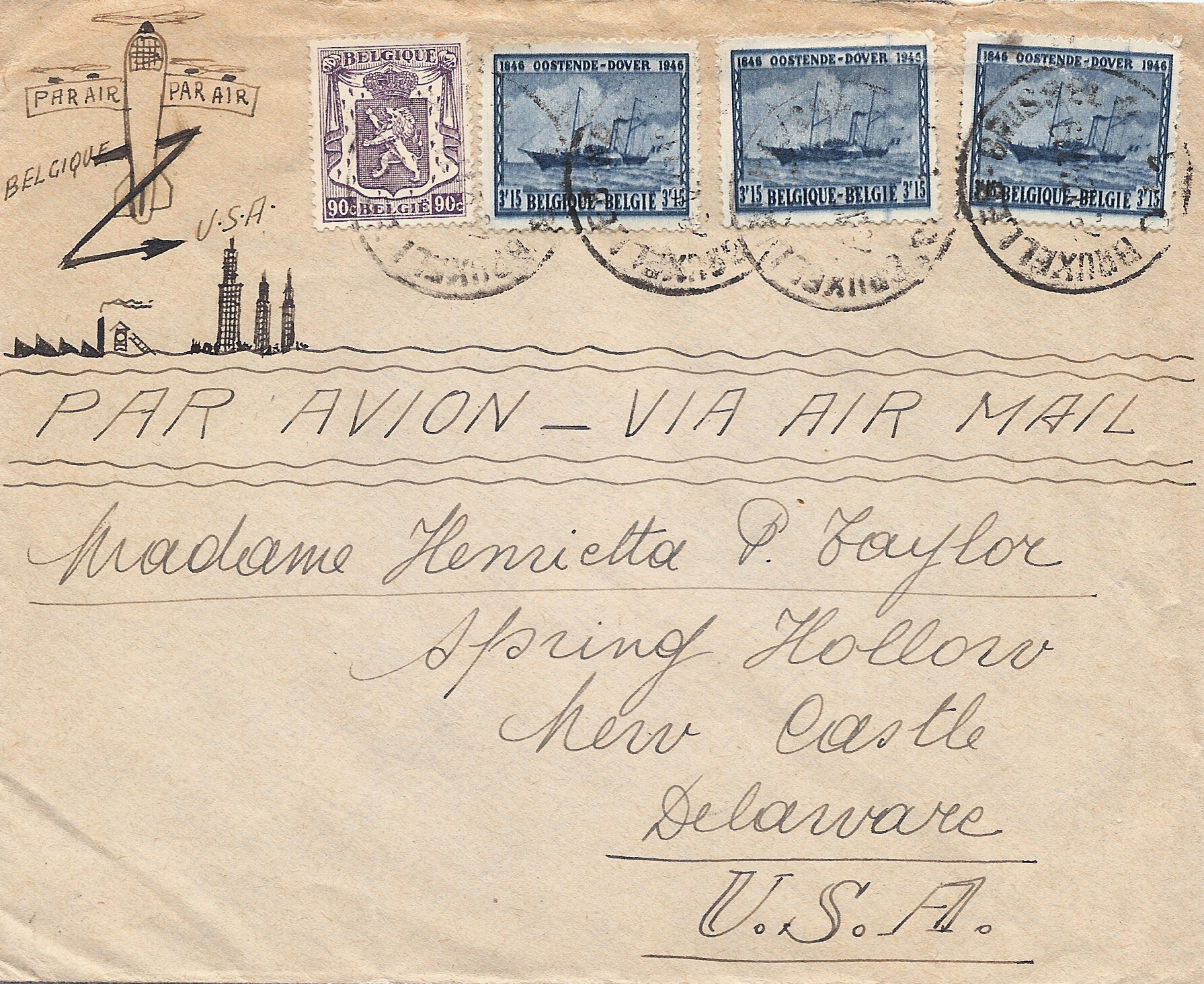
A charming pen drawing graced the upper left corner of a 1946 cover from Belgium; the sketch shows a Belgian factory and an American skyline. (Figure 3) Something seen from time to time is the usual red and blue airmail border being added by hand. That makes sense in this return card for which the sender wanted air service. (Figure 4)
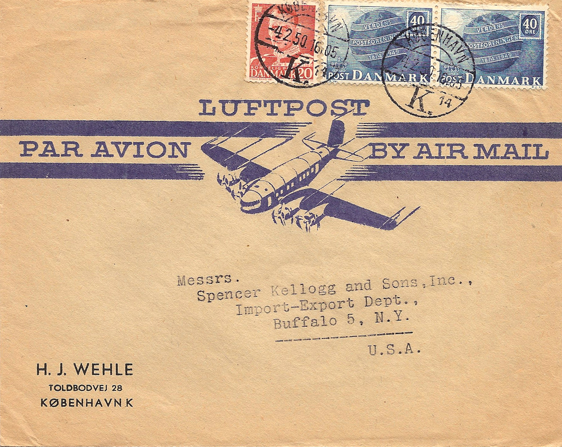
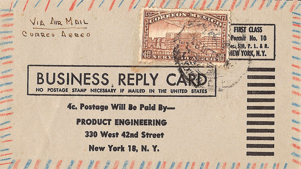
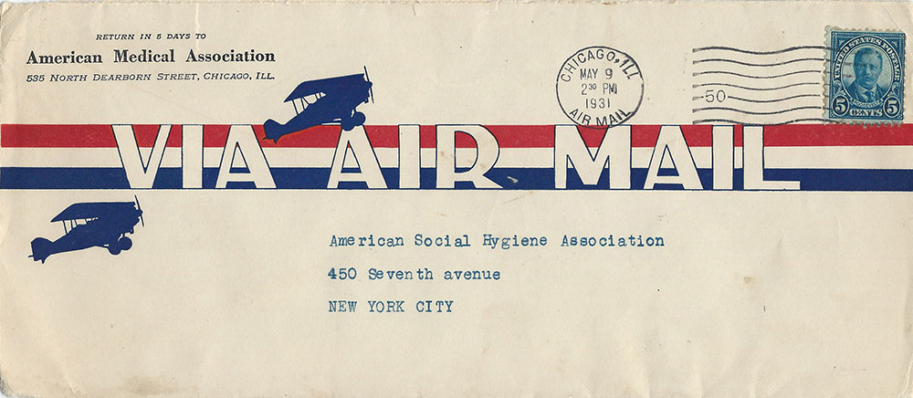
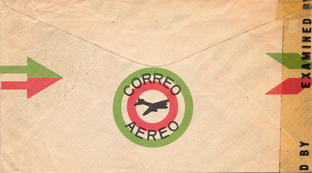
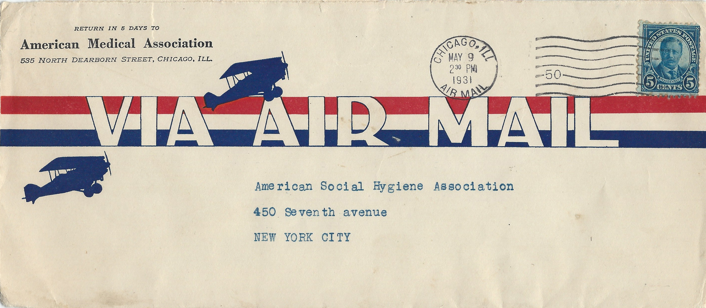
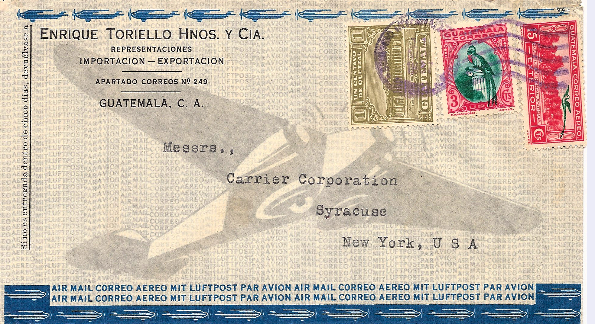
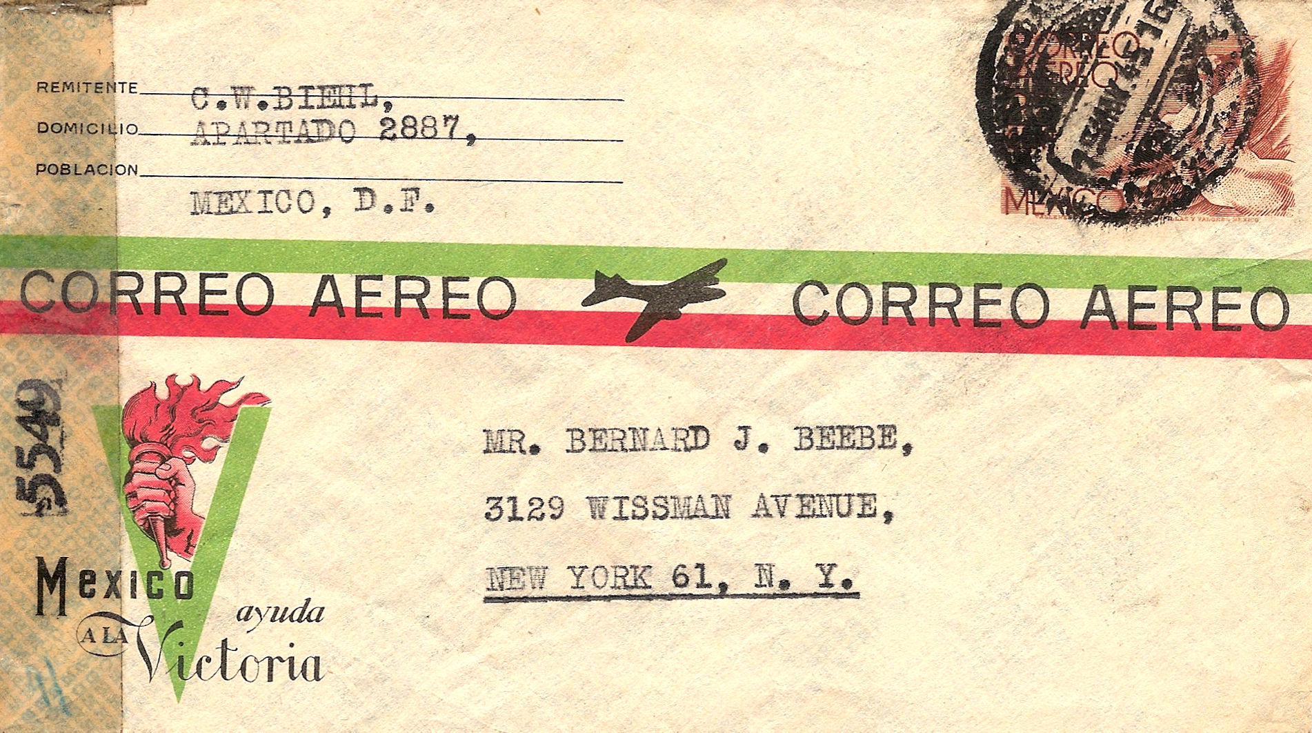
Figures 5-8 show four generic envelope designs: U.S. 1931 (Figure 5), Denmark 1950 (Figure 6), Guatemala 1937 (Figure 7) and Mexico 1945 with extra pizzazz from the censor label (Figures 8a&b).
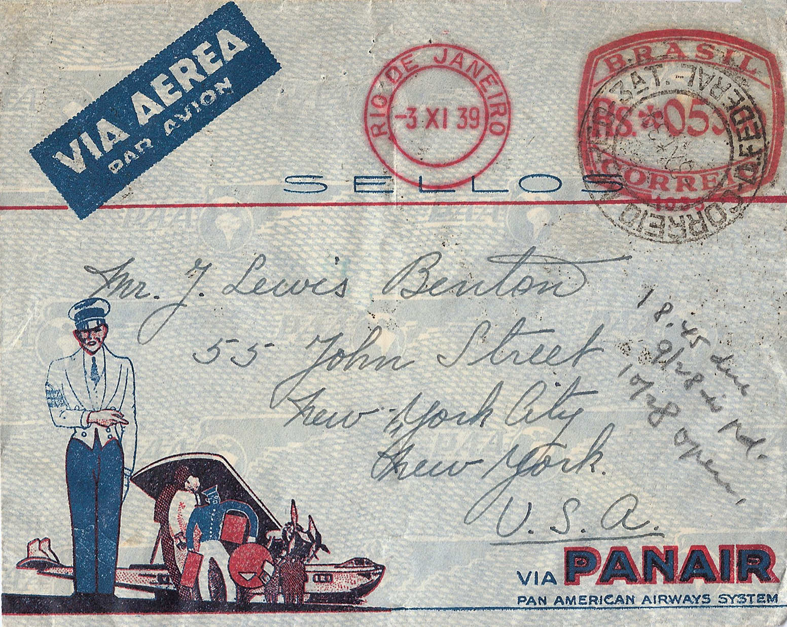
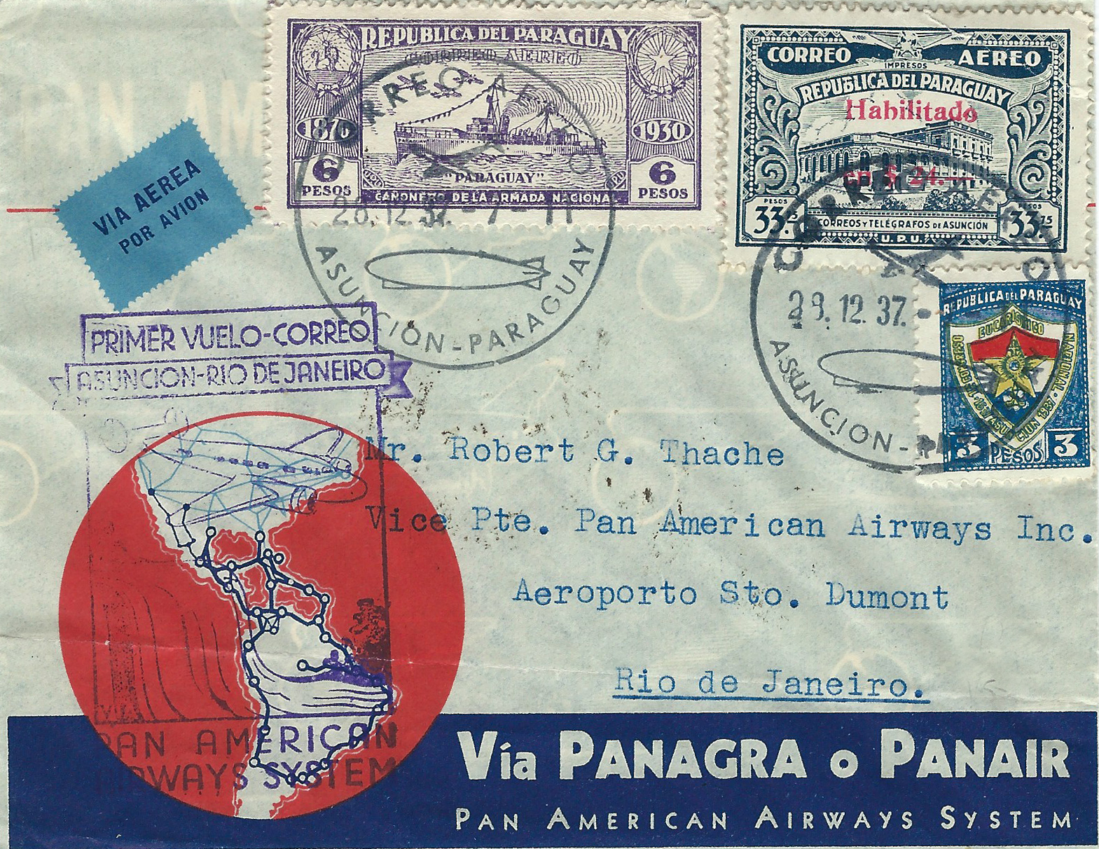
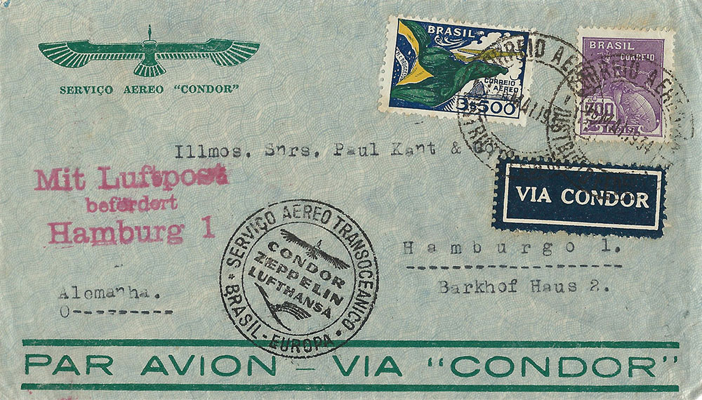
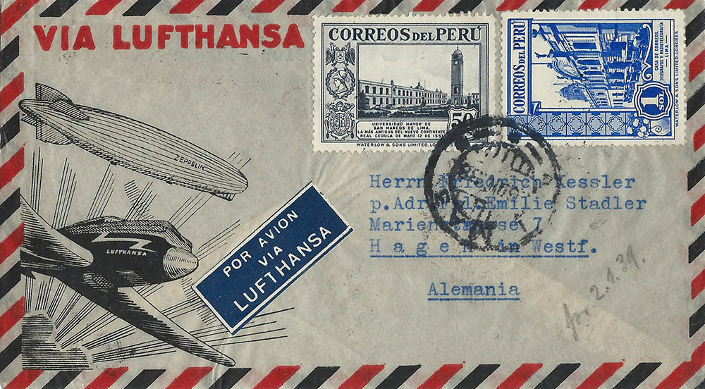
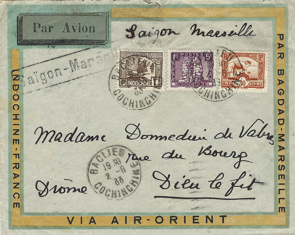
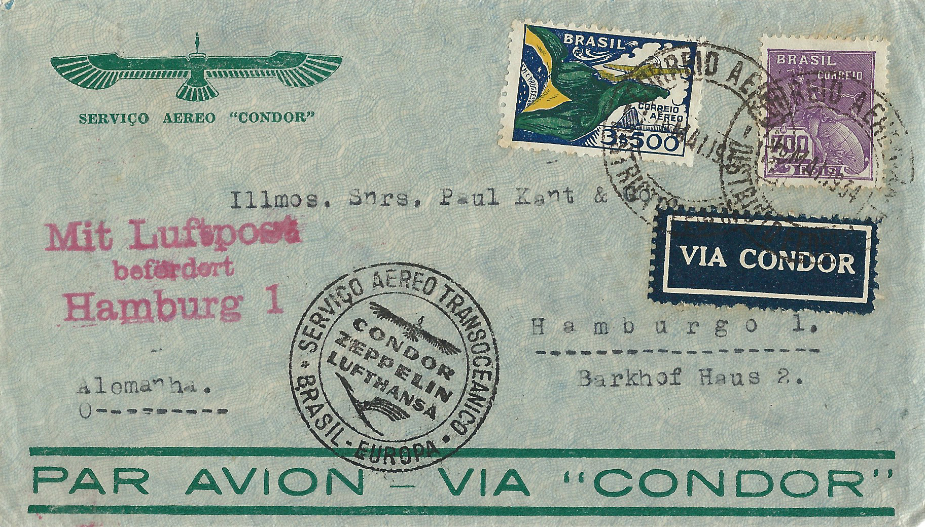
Envelopes produced for use by airlines tend to be a bit more eye-catching: Brazil Condor 1934 (Figure 9), Brazil Panair 1939 of which there are a number of varieties (Figure 10), Paraguay Panagra/Panair carried on first Pan American flight from Asuncion to Rio (Figure 11), Peru Lufthansa 1938 (Figure 12) and Indochina Air Orient 1930 (Figure 13).
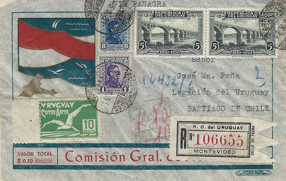
Figure 14 is a rather interesting outlier. The Uruguay 1931 envelope specifies that there was an additional fee of 50¢ to Comisión Gral. De Aeronáutica (General Commission not specifying an airline) for air service. The image at the upper left is typical of the remarkable graphics seen in Uruguay at this time.
When I find another critical mass of these lovely envelopes, I will share them. AS always I’s love to hear from readers.
Written by Arthur H. Groten M.D.
Please note that this first appeared in the American Stamp Dealer & Collectors Magazine, #97, February 2016
_____________________________________________________________________________
The designs seem to fall into three basic categories: hand-drawn, those made by airline companies and those either generic or specific to a non-airline company.
Hand-drawn ones have a charm all their own. They are usually made for non-philatelic purposes, manifesting the sender’s imagination. They are direct descendants of the 19th century British pen and ink covers (whose artistry is usually quite a bit more evident). The 1939 cover was carried from Belgium on the first flight from France to the U.S. The use of an air etiquette to help define the shape of the drawing shows some design sense. First flight covers rarely have such flamboyance. (Figures 1a&b)
Cpl. Holmes, stationed at Hawaii, received a rather striking cover from New York. It even has a tied-on Christmas seal. (Figures 2a&b)
A charming pen drawing graced the upper left corner of a 1946 cover from Belgium; the sketch shows a Belgian factory and an American skyline. (Figure 3)
Something seen from time to time is the usual red and blue airmail border being added by hand. That makes sense in this return card for which the sender wanted air service. (Figure 4)
Figures 5-8 show four generic envelope designs: U.S. 1931 (Figure 5), Denmark 1950 (Figure 6), Guatemala 1937 (Figure 7) and Mexico 1945 with extra pizzazz from the censor label (Figures 8a&b).
Envelopes produced for use by airlines tend to be a bit more eye-catching: Brazil Condor 1934 (Figure 9), Brazil Panair 1939 of which there are a number of varieties (Figure 10), Paraguay Panagra/Panair carried on first Pan American flight from Asuncion to Rio (Figure 11), Peru Lufthansa 1938 (Figure 12) and Indochina Air Orient 1930 (Figure 13).
Figure 14 is a rather interesting outlier. The Uruguay 1931 envelope specifies that there was an additional fee of 50¢ to Comision Gral. De Aeronautica (General Commission not specifying an airline) for air service. The image at the upper left is typical of the remarkable graphics seen in Uruguay at this time.
Please note that this first appeared in the American Stamp Dealer & Collectors Magazine, #97, February 2016 Written by Arthur H. Groten M.D.
It is no secret that I am enamored of all things related to commercial aviation. In the May 2013 issue of American Stamp Dealer & Collectors Magazine #70, I wrote about U.S envelopes preprinted to indicate airmail service. I can show some more, this time adding foreign ones. They speak for themselves and I will let them do that after a few brief comments.
The designs seem to fall into three basic categories: hand-drawn, those made by airline companies and those either generic or specific to a non-airline company.
Hand-drawn ones have a charm all their own. They are usually made for non-philatelic purposes, manifesting the sender’s imagination. They are direct descendants of the 19th century British pen and ink covers (whose artistry is usually quite a bit more evident). The 1939 cover was carried from Belgium on the first flight from France to the U.S. The use of an air etiquette to help define the shape of the drawing shows some design sense. First flight covers rarely have such flamboyance.
Figure 1a
Figure 1b
Cpl. Holmes, stationed at Hawaii, received a rather striking cover from New York. It even has a tied-on Christmas seal.
Figure 2a
Figure 2b
A charming pen drawing graced the upper left corner of a 1946 cover from Belgium; the sketch shows a Belgian factory and an American skyline.
Figure 3
Something seen from time to time is the usual red and blue airmail border being added by hand. That makes sense in this return card for which the sender wanted air service.
Figure 4
Figures 5-8 show four generic envelope designs: U.S. 1931, Denmark 1950, Guatemala 1937, and Mexico 1945 with extra pizzazz from the censor label.
Figure 5
Figure 6
Figure 7
Figure 8a
Figure 8b
Envelopes produced for use by airlines tend to be a bit more eye-catching: Brazil Condor 1934 (Figure 9), Brazil Panair 1939 of which there are a number of varieties (Figure 10), Paraguay Panagra/Panair carried on first Pan American flight from Asuncion to Rio (Figure 11), Peru Lufthansa 1938 (Figure 12) and Indochina Air Orient 1930 (Figure 13).
Figure 9
Figure 10
Figure 11
Figure 12
Figure 13
Figure 14 is a rather interesting outlier. The Uruguay 1931 envelope specifies that there was an additional fee of 50¢ to Comision Gral. De Aeronautica (General Commission not specifying an airline) for air service. The image at the upper left is typical of the remarkable graphics seen in Uruguay at this time.
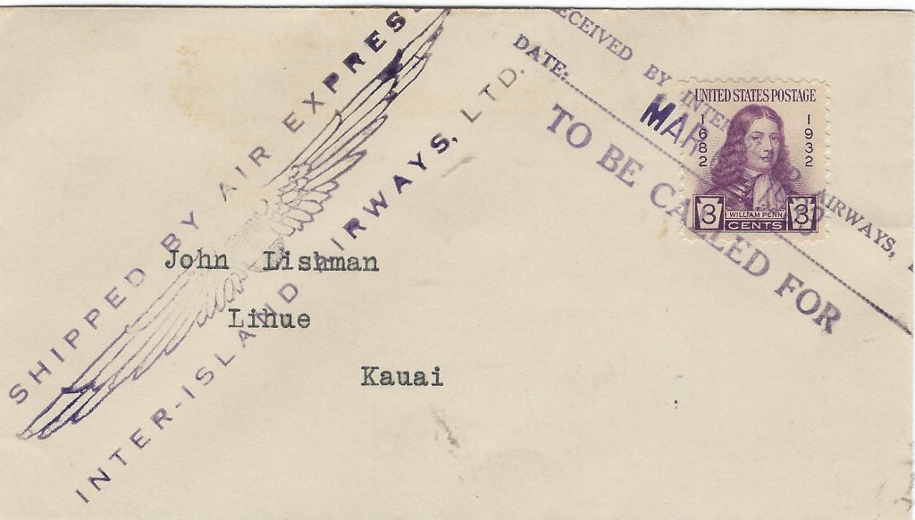
Inter-Island Airways was founded in early 1929 by a local steamship company to link Honolulu with the outer islands in November of that year.
Sometime thereafter, either 1930 or 1931, they established an Air Express service to carry mail between Honolulu and Hilo. By 1934, the name had become Hawaiian Airlines, Inc. which officially carried mail as AM Route 33 (revised) as of October 8, 1934.
Recently I came across a group of seven covers from 1931 to 1933 with various hand stamps for the Inter-Island Airways, Ltd. Air Express. There were two hand stamps used. One is three-line reading “Shipped by Air Express/[ a pair of wings]/Inter-Island Airways., Ltd.” used 1931 to 1933 in blue and purple (Type 1). The second reads “Received by Inter-Island Airways, Ltd/Date:…./To Be Called For” in purple in 1932-1933 (Type 2).
Of the seven covers, five are definitely commercial while two are probably philatelic. The rating and hand stamps on the commercial covers are as follows: 1) Aug 1, 1931 unfranked but has several numbers on it probably some form of accountancy, Type 1 in blue; 2) October 28, 1932 (hand-dated) on R.R.B. cover, Type 1 in blue; 3) April 1, 1932 2¢ Washington Bicentennial postal envelope, Type 1 in blue (Figure 1); 4 & 5) not dated,, lightly tied with Type 2 in purple, one franked 2¢ postal envelope + 1¢ Franklin, the other with 4¢ + 8¢ Washington Bicentennial issue stamps (Figure 2). The two suspected philatelic covers have 1) 3¢ William Penn tied with Type 2 with Type 1 alongside, both in purple (Figure 3) and 2) 3¢ Oglethorpe tied by Type 2 in purple. None have back stamps.
From this small sample we can surmise that Type 1 was in blue 1931-1932, later purple and that Type 2 appeared in 1933 in purple. The 12¢ rate is an outlier, perhaps a multiple weight.
So much for the description of the group, I have been able to find no information about the service or any catalogue listing. That surprises me. I ask if anyone can help. I can be reached here.
Over the years I have devoted a number of columns to various aspects of aviation paraphilately. This column will describe some bits of more or less philatelic ephemera. I have not been able to accumulate enough for a column devoted to any one of these topics so let’s call this a miscellany.
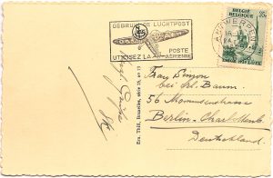
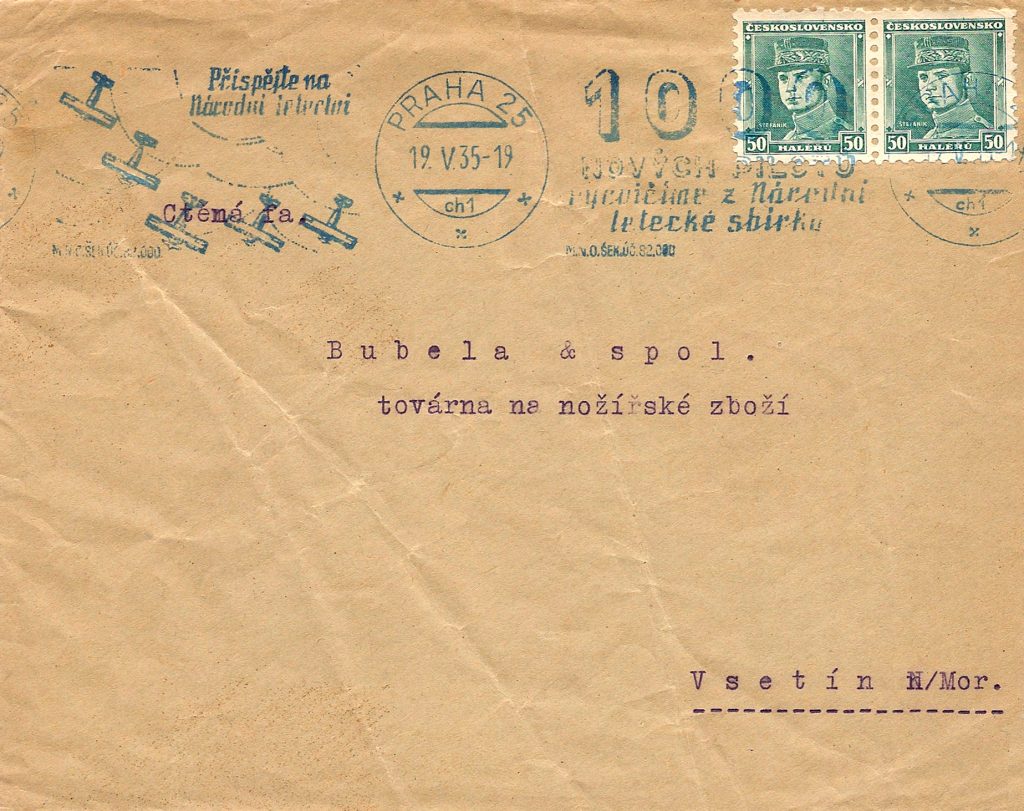
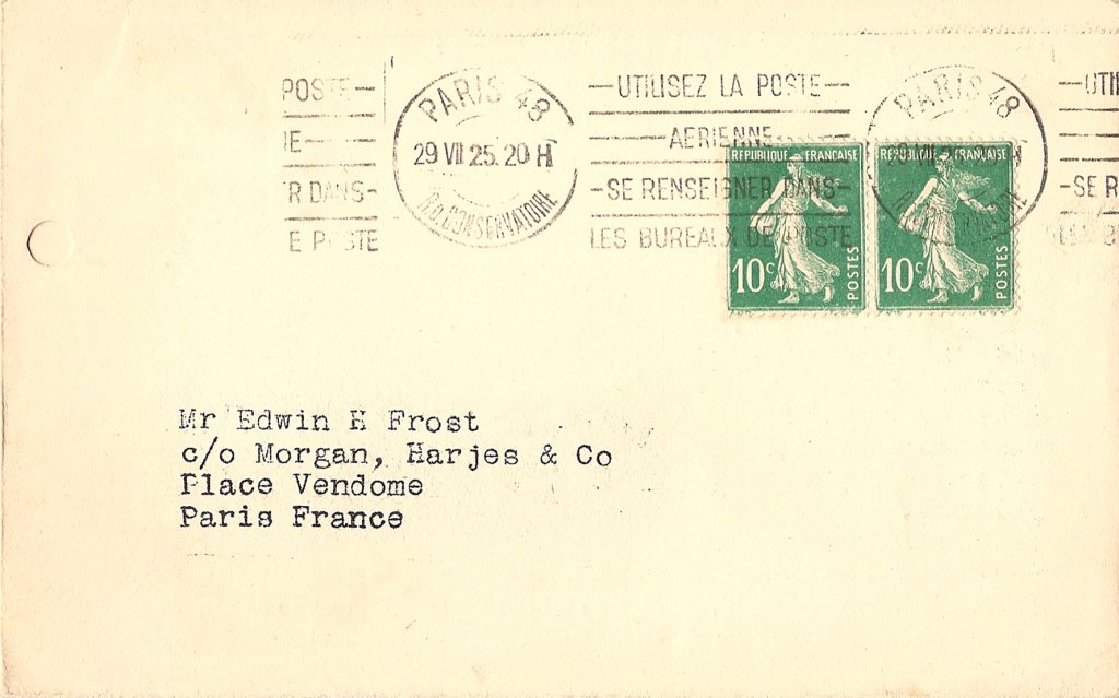
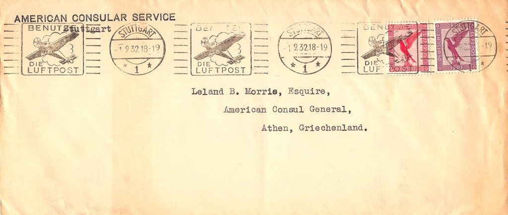
Covers have been used for advertising and promotional purposes since the mid-19th century. I have written about how government promoted the development of aviation in the U.S. using various pieces of ephemera. This, of course, happened elsewhere as well. Examples from Belgium, Czechoslovakia France and Germany show how the slogans on machine cancelling devices of the 1930s sent the same message: use airmail. (Figures 1-4)
Figure 1
Figure 2
Figure 3
Figure 4
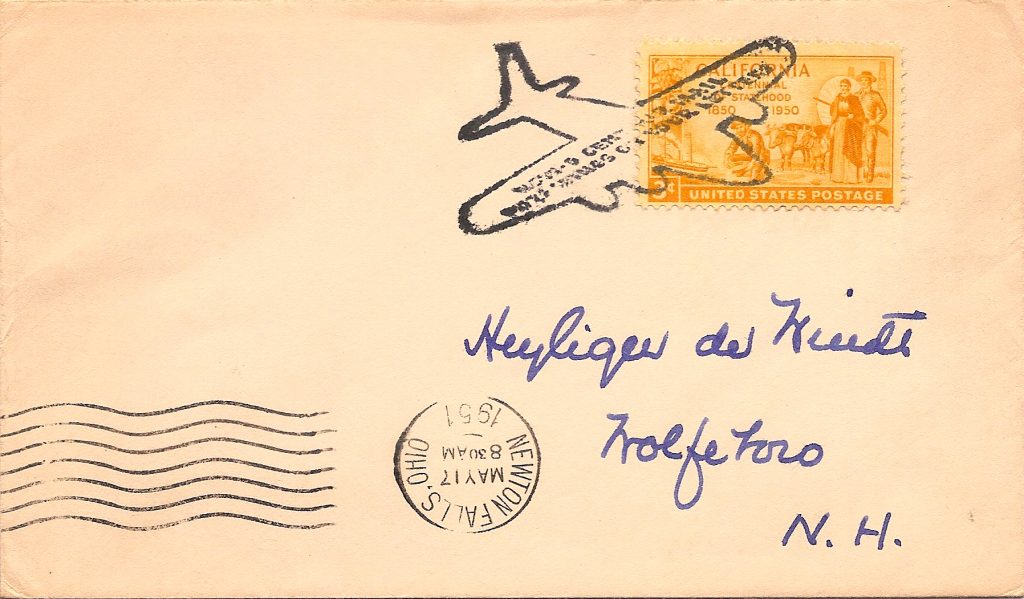
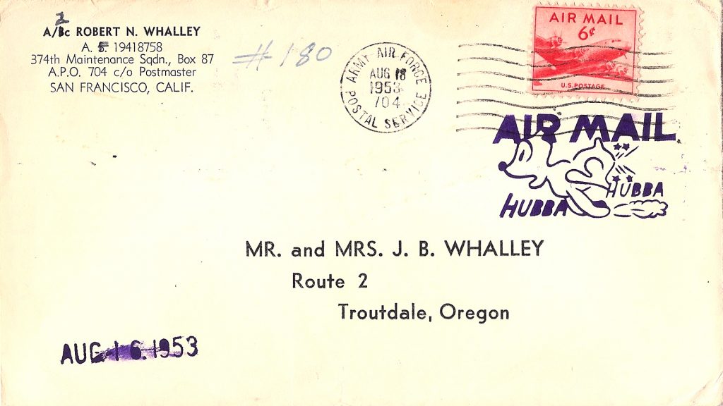
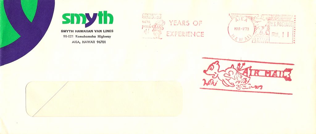
Beloved of philatelists are fancy cancels. I have found only this 1951 one that notes the 5¢ airmail rate. (Figure 5) Adjuncts are the myriad private hand stamps such as the 1953 “Air Mail Hubba Hubba” used from APO 704 in Japan (Figure 6) and the 1973 “Air Mail Wiki Wiki” from Hawaii. (Figure 7)
Figure 5
Figure 6
Figure 7
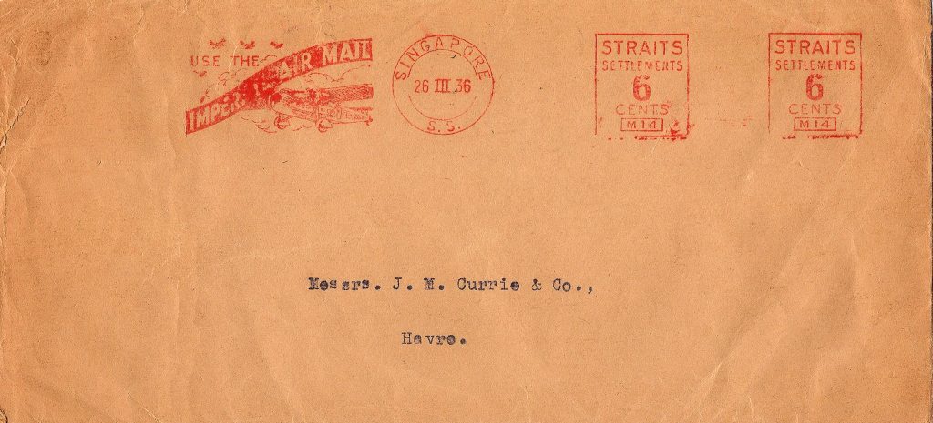
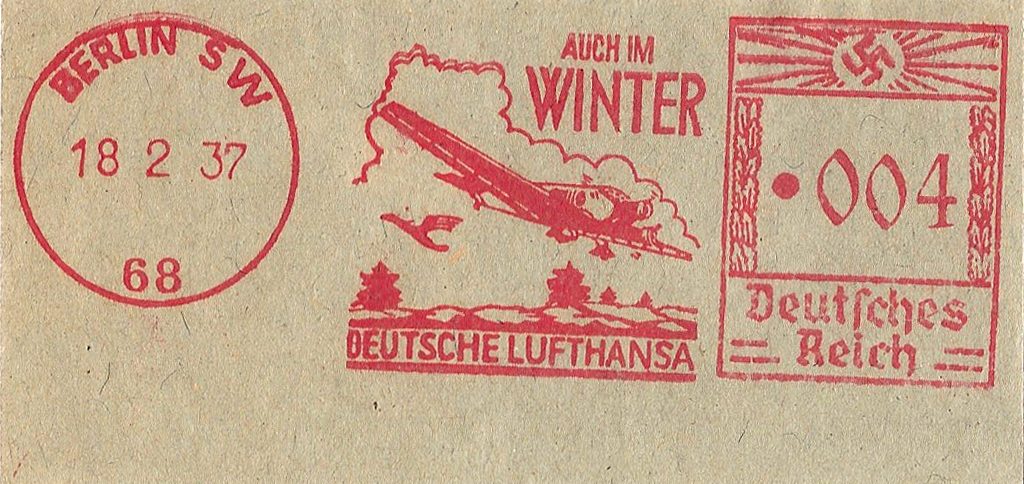
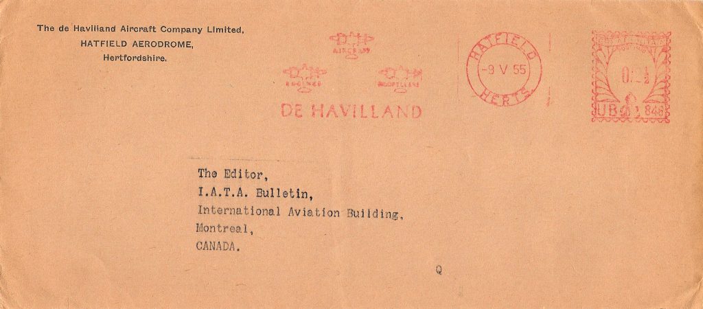
Particularly popular, beginning in the 1930s, were the recently created meter machine slogans. They were particularly popular with companies as free visual advertising. Thus, Imperial suggested to use their airmail from Singapore in 1936 on a cover franked with the scarce Universal “Midget” imprint. (Figure 8) Lufthansa had many different slogans for their services during the 1934-9 period; they used Francotype machines, in this case, type D multi-value. (Figure 9) The de Havilland Aviation Co. at Hatfield Aerodrome in Hertfordshire mentioned their production of aircraft, engines and propellers in 1955 on the Universal “Multi-value” machine. (Figure 10)
Figure 8
Figure 9
Figure 10
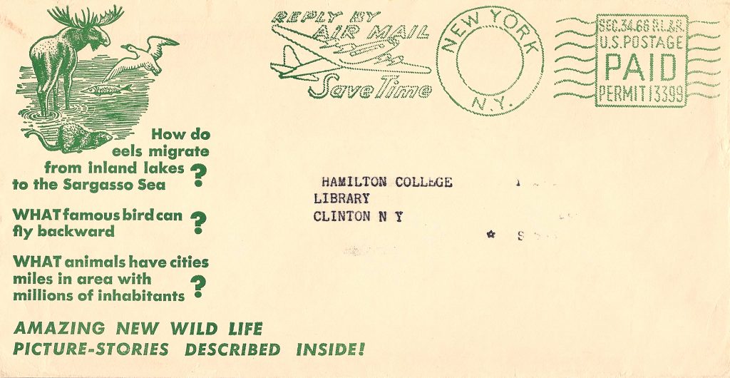
Amongst the rarest of such slogans are those found on permit imprints. The one shown in Figure 11 is known in red, blue and green, all from the same company with the same permit number 13399.
Figure 11
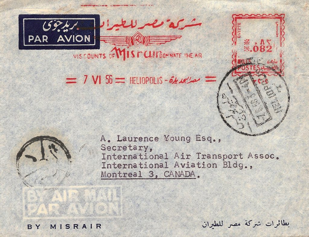
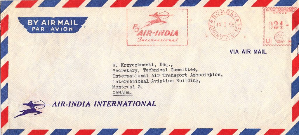
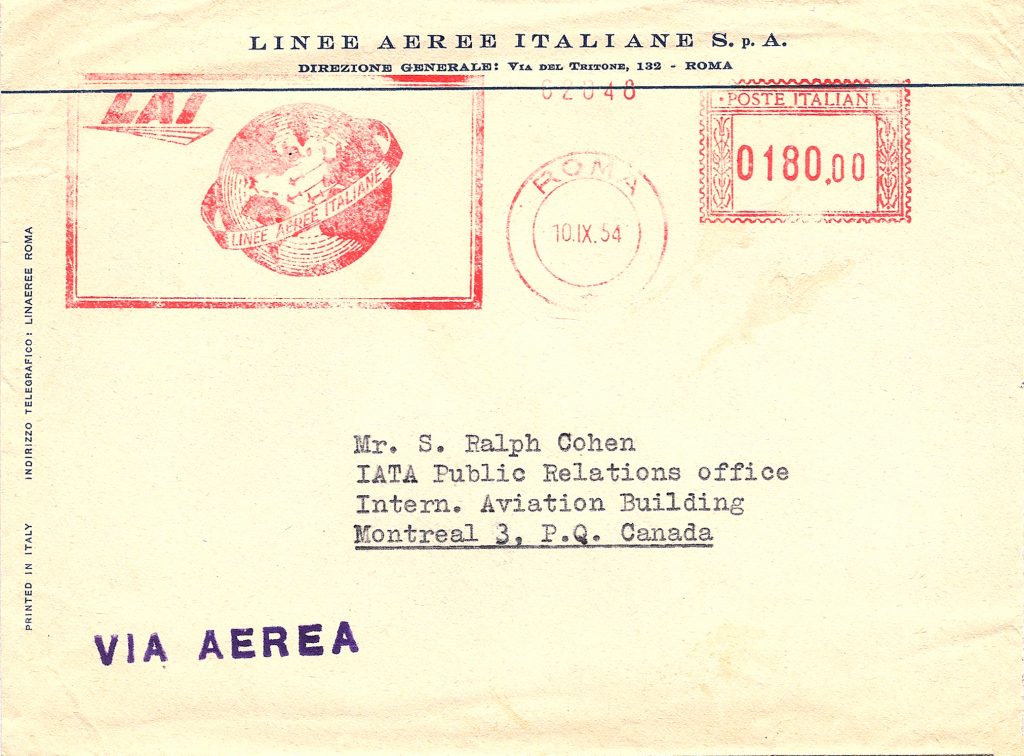
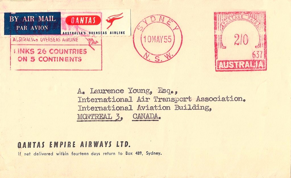
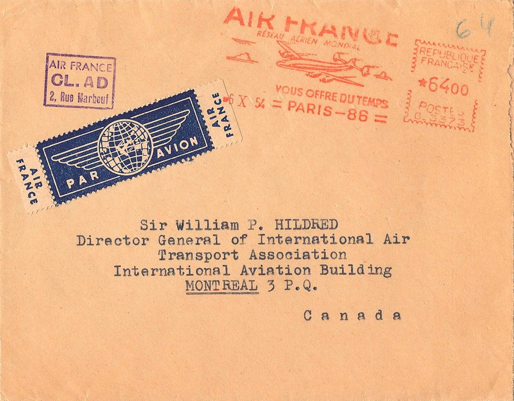
In keeping with the tradition of the advertising cover, many airlines used envelopes imprinted with their name, often franked with slogan meters and, on occasion, found with their own airmail etiquettes. Examples of the former, from Egypt (MISR), India (Air India) and Italy (LAI) (Figure 12-14), and of the latter from Australia (Qantas) and France (Air France) are a sampling of what can be found. (Figures 15-16)
Figure 12
Figure 13
Figure 14
Figure 15
Figure 16
These covers neatly bridge the philately/paraphilately aspects of our hobby and are examples of how to enhance one’s collection (and exhibit, if one wishes) with collateral material. Or is it collateral? You decide.
American Airlines, as we know it today, first appeared as such in 1934 after E.L. Cord of automotive fame acquired American Airways and renamed it. They worked closely with Donald Douglas to develop the DC-3, the first airplane to carry passengers at a profit without subsidy for mail handling. They were instrumental in establishing LaGuardia Airport.
I shall look at the etiquettes they issued prior to the post-war acquisition, in 1948, of American Export Airlines to form American Overseas Airlines, sold to Pan Am in 1950.
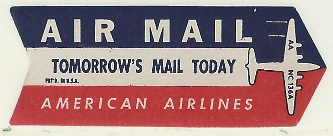
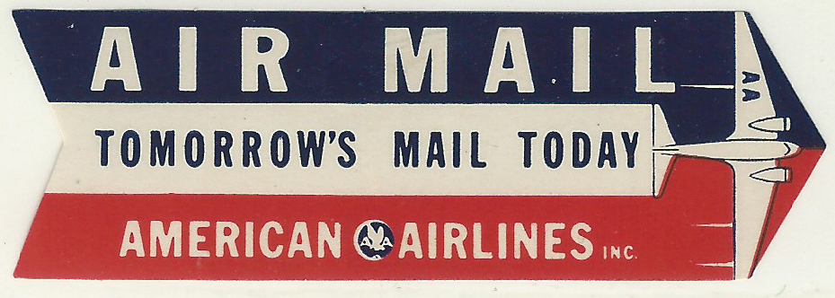
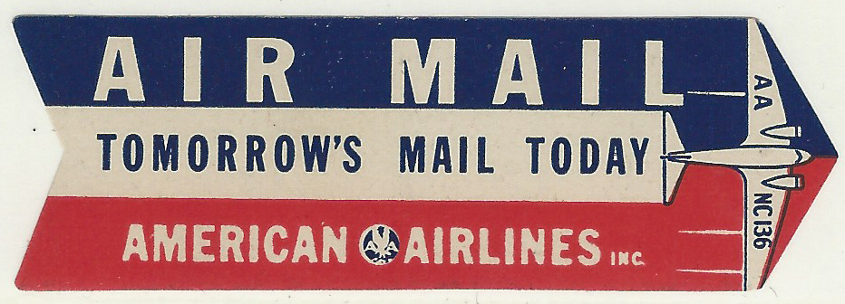
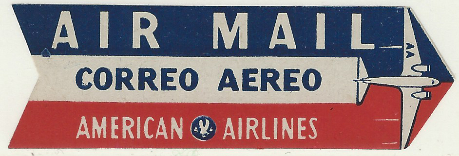
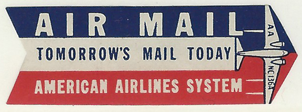
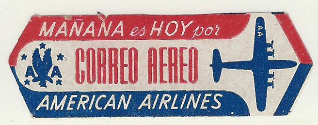
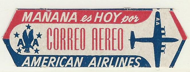
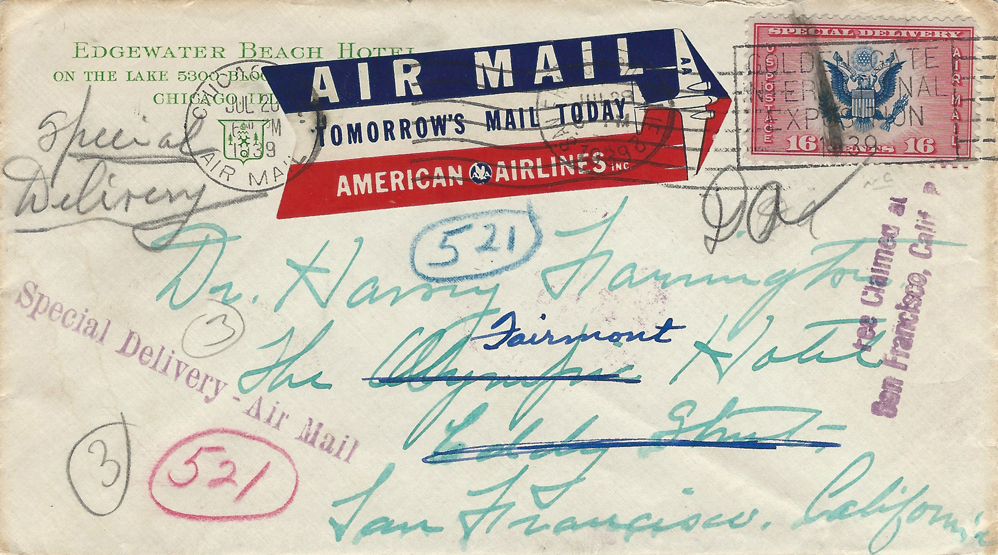
All American Airlines labels were either arrow-shaped or a horizontal hexagon. The first appeared in 1937, claiming “Tomorrow’s Mail Today.” This slogan appeared on all but two of the 8 and two of those in Spanish (Figures 6 & 7 which differ in the size of the lettering). The first four separated “American” and “Airlines” with their flying eagle logo (Figures 1-4); thereafter that logo was omitted.
As you will note in the illustrations, several have “NC136” or NC136A’ on the right wing (Figures 2, 3, 5 & 8). I do not know the significance of this. Perhaps a member can enlighten me.
The first of the two covers I show is from Chicago in 1939 to San Francisco and forwarded within that city, using the first etiquette produced (Figure 9). The 16¢ stamp paid the 6¢ airmail postage and the 10¢ special delivery fee. The second, a postcard, was sent from Mexico using the Spanish-language label. (Figure 10)
The study of American Airlines etiquettes can be extended to include their many early subsidiaries as well as those issued after the War. The last etiquette appeared in 1962.
This article is part of The Captain’s Log, Issue 40-4, Spring 2016
Arthur H. Groten M.D.
For the past several years I have been writing about those funny little pieces of paper that are applied to envelopes to designate carriage by air. I have been a stamp collector for 65 years although for the past 20 or so I have concentrated on postal history or how the postal system works.
We have all seen etiquettes on letters such as airmail, registered, certified and special delivery, to name a few. They tell us what additional services are being utilized. Because much of my interest in postal history has centered on the development of commercial airmail I started paying attention to the labels. Recently, I’ve begun limiting my collection to those used before WWII and I still have several thousand different with many used on envelopes.
You’ve had a taste of these covers in my articles which tend to be about a specific country or theme. Those will continue. Here I want to show a number whose unifying theme is that each is the first airmail etiquette issued by the country involved.
The very first was issued by France on August 17, 1918, a simple boxed “Par Avion” on red paper. (Figure 1) It is on a postcard carried on the first experimental flight by A. Vancaudenberghe at St. Nazaire.
A number of labels specify the route to be used such as Czechoslovakia’s 4 different destinations from Prague. Figure 2 calls for the route from Prague to the Netherlands to pass through Strasbourg. The other routes were through Paris, Warsaw and London. Another, from the Ivory Coast to Paris in 1931, noted “de Dakar a Toulouse.” (Figure 3)
Some, though not many, have the country name on them such as the etiquette on this registered cover from Madagascar to Paris on the first official flight between the two countries in 1930. (Figure 4)
Others indicate the extra postage required for airmail as on this 1934 cover from Mozambique to Scotland: the air fee was Fr. 1.05. French is the official international postal language. In this case, Mozambique added the Portuguese “Por Aviao” to the French “Par Avion.” (Figure 5)
From Tahiti to France in 1927, a particularly rare label was used to seal the letter. (Figure 6)
Etiquettes in the shape of arrows are often seen as on this 1931 cover from Guatemala. The paired oblique lines indicate the end of air service, in this case, most likely in the U.S. (Figure 7)
I have many more and, in due course, they will appear in these pages. I welcome correspondence with interested members.