HISTORY OF SAFETY CARDS, Part 5: Maturing (1970s-1980s)
By Fons Schaefers
Introduction
In the previous issue, we saw that in the mid-1960s safety cards became mandatory. This caused a proliferation of safety cards and parties being involved in their design and production. It set in motion some trends and developments that shaped the appearance of safety cards until this day. Let’s review them.
Expansion
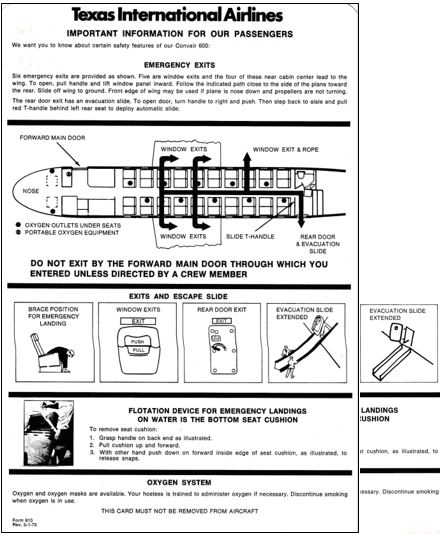
The first trend was that, now that safety cards were mandatory, all airlines applied them. This included smaller airlines such as regional and air taxi operators which before did not have them. The USA led, but many other countries followed suit. A US example is Texas International Airlines, a local airline operating Convair 600s and DC-9s. It earned its “international” nomer because it flew across the border to Mexico. Its 1970 Convair 600 card has a mix of drawings and text, in English on one side and Spanish on the other. A revision of the card 2.5 years later is identical except for the evacuation slide. This is now of the inflatable kind, but who noticed?
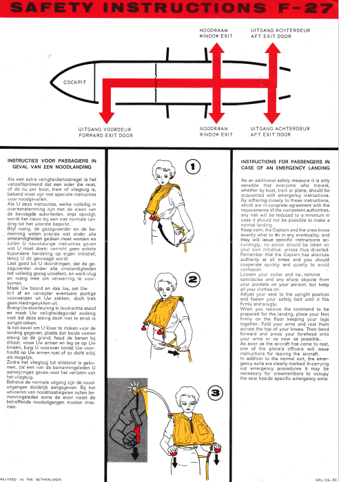
An early example from Europe is a card for the Fokker F.27. Although it does not say so, this card was in use with NLM. That stands for Nederlandse Luchtvaartmaatschappij – Netherlands Airlines, which started in 1966 and was affiliated to KLM. Initially, it flew domestic routes only with two F.27s leased from the Royal Netherlands Air Force, but gradually expanded into a regional carrier. It exists today as KLM Cityhopper. The card reproduced was its first card and dates back to about 1970. Its design did not follow the style in use by KLM at the day. Rather, it was copied from a sample made by Fokker, the aircraft manufacturer. Text prevailed, in Dutch and English on the front side, German and French on the back. The title however was only in English – on both sides.
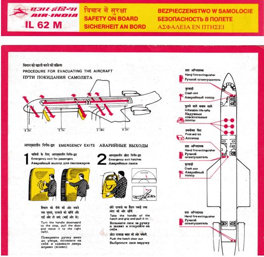
A trend that emerged in the 1970s and 1980s was leasing of aircraft between airlines. There are many varieties of leasing. For the safety card collector, the most interesting one is where there is a mix of features on it from both the lessee (the airline that leases in) and the lessor (the airline that leases out). An example is the Aeroflot Ilyushin 62 that was leased out to Air India in the late 1980s. For the passengers, it should have the look of Air India, hence the Air India logo. All text is in three languages: Hindi, English and Russian, except that the header has three more languages: German, Polish and Greek, probably a remnant from the Aeroflot example. Note the distances to the ground from exit sills. Only Russian cards have this useful information.

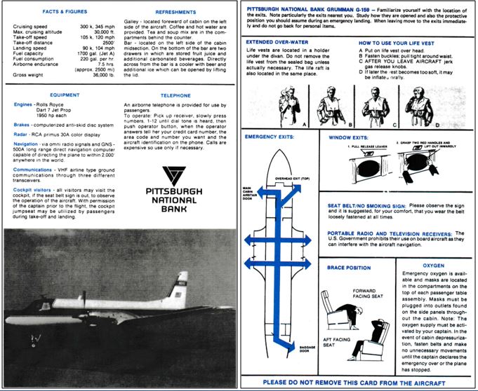
Safety cards also found their way on non-commercial transport aircraft. An example is the Gulfstream 1 operated by Pittsburgh National Bank from 1983 to 1985. This aircraft sat less than 20 passengers so there was no cabin staff on board. The card explains where passengers can find the refreshments and that cockpit jump-seat rides are allowed!
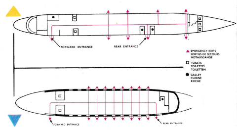
In some countries the introduction of safety cards was delayed. In the UK it remained common well into the 1970s to have safety information included in the company’s in-flight magazine instead of having a separate safety briefing card. See the British Eagle sample in the previous part, and the exit diagrams for the Britannia and the ample-exited Viscount below.
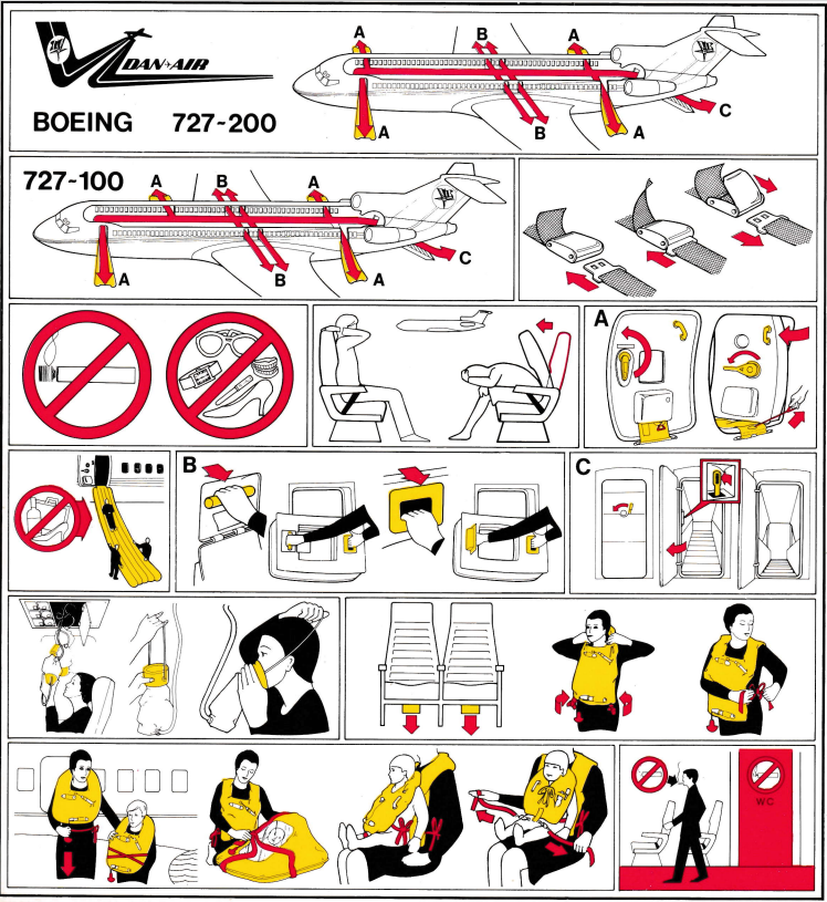
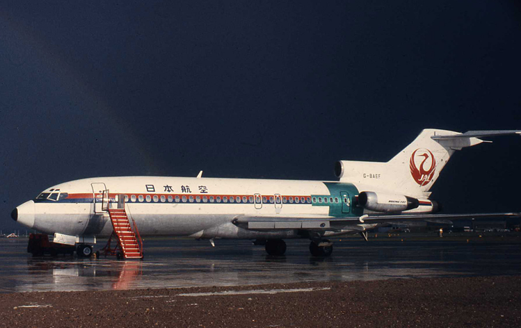
But when indeed a separate safety card was used in Britain, the American rule prohibiting mixing aircraft types with different exit layouts was not always followed. This mid-1970s Dan-Air card showed both the 727-100 and the 727-200. Although seemingly of the same length, the -100 was actually significantly shorter and had a different exit layout. Some of you probably spotted the error for the 727-100: side exits aft of the wing! These were only on the -200, weren’t they? Actually, this was not an error. In the early 1970s Dan-Air obtained short body 727s from Japan Airlines and converted them into a high-density seating layout. For that, two extra, opposite exits were required by the British Civil Aviation Authority (CAA).Below photo, courtesy of I Spashett, shows G-BAEF’sleft side with the new exit just added, awaiting painting in Dan-Air colours. Reportedly, they could sit 153 passengers, but I doubt whether that figure is correct. An already very cramped layout on Seating Plans – DAN AIR REMEMBERED shows 144 seats. Perhaps the 153 figure included the crew?
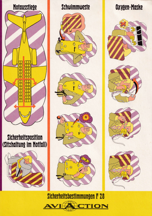
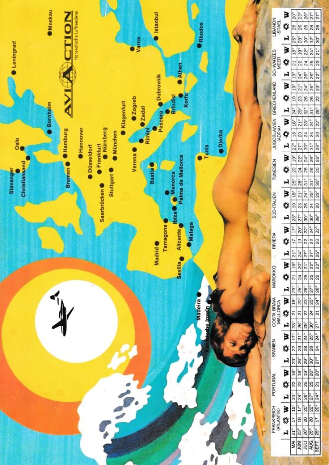
In China, aviation safety was not a priority until well into the 1990s. It was common for airliners not to have any safety card on board, or the wrong one, stowed away in a hat rack, as the author experienced in 1989 when flying on a CAAC Hawker Siddeley Trident but finding a CAAC BAe 146 card. Another airline that did not take safety cards too serious was Aviaction from Germany. One side of its card shows the bare minimum of safety features, the other side presents the destinations of this holiday charter airline and a beach lady in bare minimums as well, clad only in sunscreen. Aviaction flew three Fokker F.28s between February 1971 and October 1973.
Pictorials and Pictograms
Another trend, developing slowly, was that of pictures replacing text. Already in the 1950s, airlines started to add illustrations to their text-based safety leaflets. Still, even two decades later, there were many safety cards where text prevailed with illustrations in a supportive role only. Gradually, this reversed into the opposite. Pictures became primary and text became supporting. There were several reasons for that. One is the adage of “a picture is worth a thousand words.” Another is the multitude of languages. Whilst for domestic US airlines, English was the dominant language. Airlines that flew internationally used many more languages. This took up much space. As we saw in the previous part, Pan Am in 1969 translated all text in eight languages and needed a booklet for this. It bundled all the illustrations on one fold-out sheet so that passengers could consult it alongside the text. A third reason is that the power of illustrations was recognized by the authorities and became formally recommended, as we will see below.
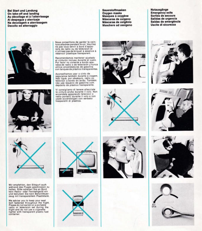
An early reverser was Lufthansa. Its 1973 Boeing 737 card combines texts in six languages with photos.
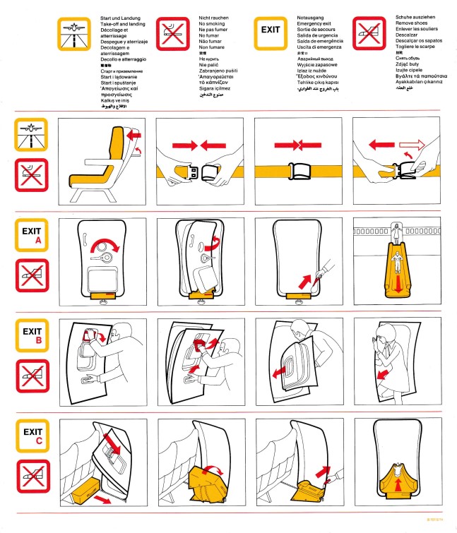
The next year they introduced an illustrations-only format. At the top of the card they added an index using pictograms. These pictograms were explained by text appearing in no fewer than 13 languages. See the Boeing 707 example, dated June 1974. Lufthansa thus became a trend-setter.
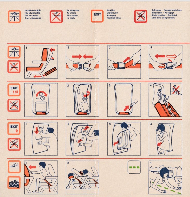
Not only was the concept of pictograms copied by many others, but often also Lufthansa’s unique drawing style itself was copied. See for instance Hungarian’s airline Malev with its 1988 card for their new 737. Until then their fleet was dominated by Soviet types.
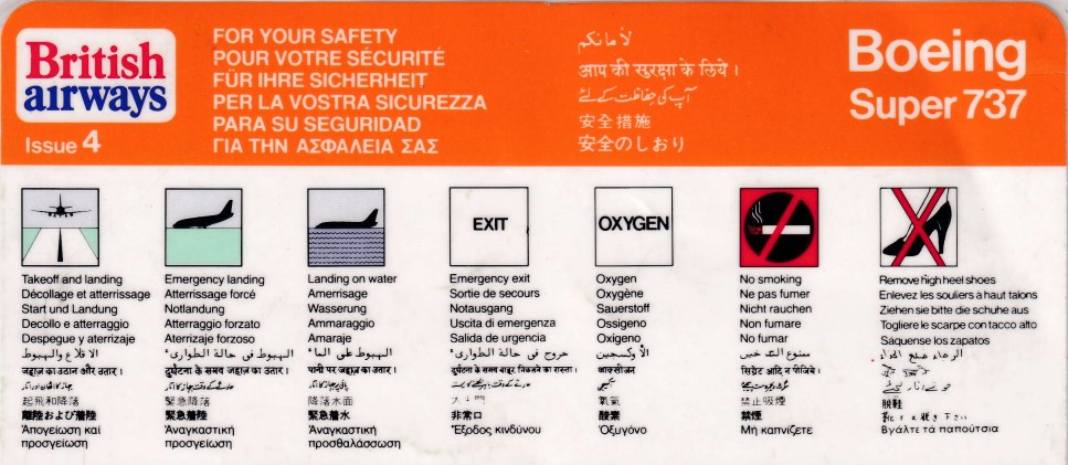
Other airlines used the pictograms concept but developed their own presentation style, such as British Airways, formed in 1974 out of a merger between BOAC and BEA. See their card for the “Super 737” which was just a first generation 737-200. These pictograms were widely copied by other airlines.
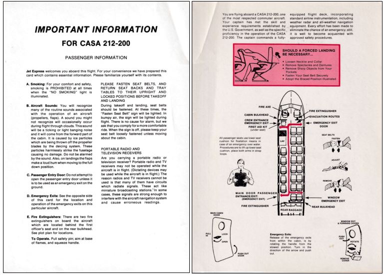
Some small airlines continued to use text based cards. In July 1989 I flew on a TWA affiliate CASA 212 from New York JFK to Atlantic City to visit the FAA Technical Centre. It was a hot day and take-off queues were long. As an alternative to air conditioning, the captain lowered the aft ramp to make us more comfortable. Its safety card, which does not show the ramp as it is not an emergency exit, is reproduced. It lists Jet Express as the operator, even though this small TWA Express carrier never operated jets, only the CASA 212.
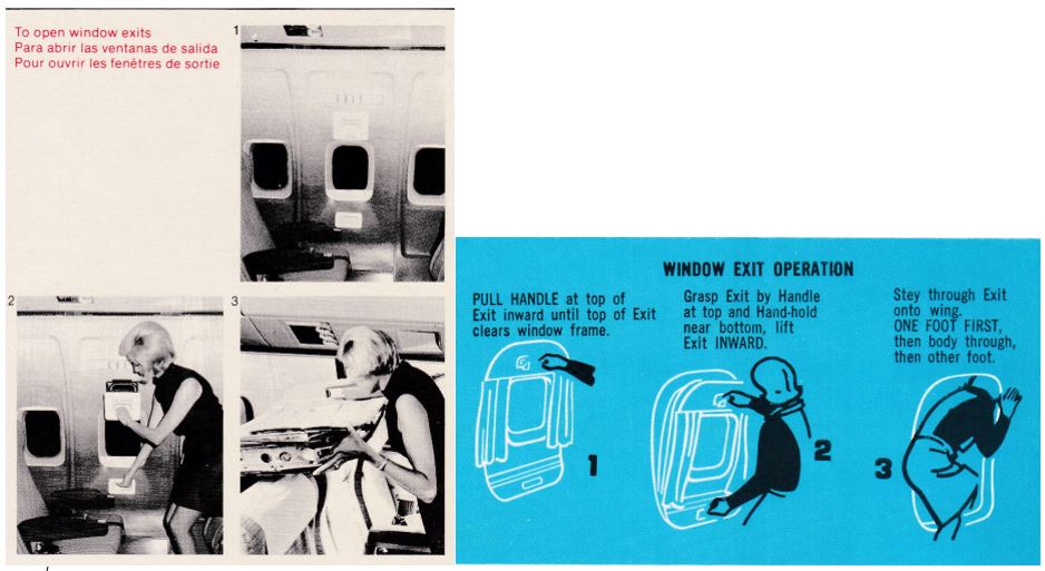
Some airlines, like American, Northwest and United preferred photographs over drawings. In the majority of cases however drawings prevailed. They have the advantage that essential actions and features can be emphasized, and backgrounds can be omitted. Compare the window exit opening presentation on an American Airlines 727 card with that of National Airlines. Which one is clearer?
Inflatables Innovation
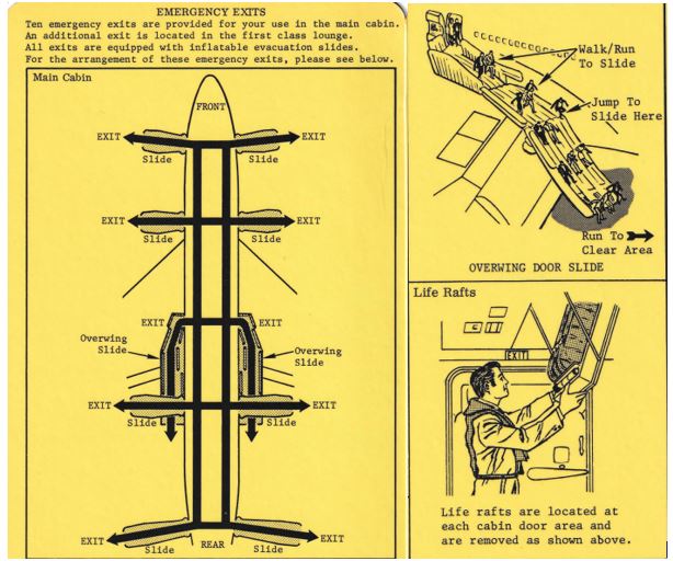
Aircraft escape chutes were invented in 1947. Ten year later, the first inflatable slides appeared. Another ten years later, the first wide-bodies were being developed. These were, initially, the Boeing 747 (four engines), the Douglas DC-10 and Lockheed Tristar (both with three engines) and, from Europe, the twin-engined Airbus A300. These aircraft sat higher off the ground so their slides had to be taller. Exits over the wing led to escape routes down the wings, with heights too high for jumping. So, special off-wing slides were made. On the first 747 cards, these were all nicely and clearly explained. Many initial operators used the same drawings, supplied by Boeing. I show panels from the Continental May 1970 card, which were identical to those of American, United or Wardair. Early 747s had separate life rafts, typically stowed in ceiling lofts, as shown by Continental. Wardair even showed a raft launching scheme. Later, the explanations got more terse, or disappeared completely, leaving only graphics, with passengers possibly puzzled as to their meaning.

Late in the 1960s, the combined slide/life raft was invented, called slide/raft. It just missed the first 747s, but all overseas DC-10 and Tristar cards show slide rafts. Nigeria Airways’ DC-10 card had the best explanation: “in case of ditching the slides are used as rafts.”
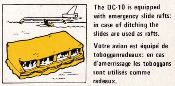
Gradually, also 747s were so equipped and separate life rafts became rare on long haul aircraft. Short haul aircraft did not need them, but there were exceptions. In the mid-1980s, East West was an Australian Fokker F.28 operator that served Norfolk Island, which is in the Pacific about 1,400 km (870 miles) from Australia. For that route, it carried life rafts near the front doors, but the safety card explains that for launching they should be carried to the overwing exits. They never had to put this to practice.
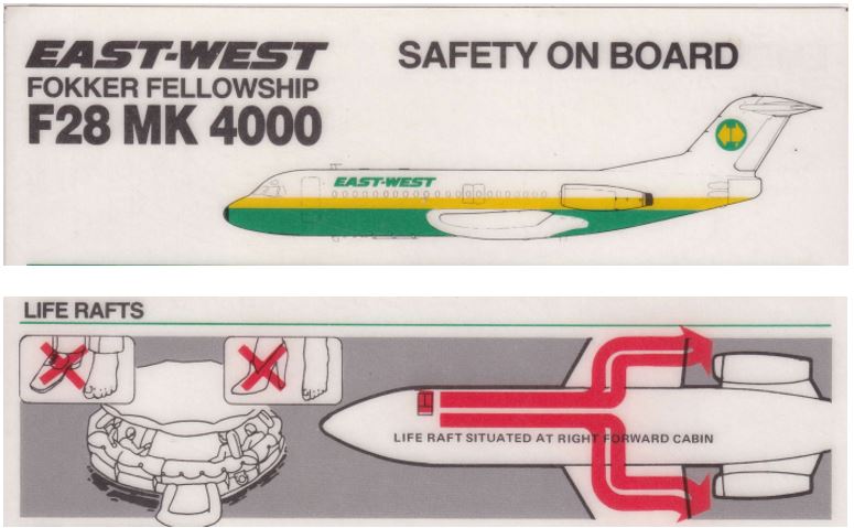
Effectiveness and Dedicated Companies
Few, if any airlines, tested the effectiveness of their cards, be it text-based or illustrations-based. The same applied to the manufacturers of aircraft, with one exception. Douglas Aircraft Company, a leading manufacturer of airliners since the 1930s, in 1967 hired two psychologists to do research in passenger safety systems and the effects of panic in crashes. They studied passenger behavior and experimented with passenger education methods. The safety systems that they studied were those typically appearing on safety cards such as exits and their operation, seat belt use and oxygen systems. But they also improved exit signs and lighting in the cabin and placards. After six years, they left Douglas (which now was McDonnell Douglas) and started a company making safety cards. They named it Interaction Research Corporation (IRC). This name reflected their modus operandi, which was to develop safety cards by means of research. They had their cards reviewed by members of the public (‘naïve subjects’) for comprehensibility of its contents. Poor scores needed improving the contents until a satisfactory score was reached. The two psychologists were Beau Altman and Daniel Johnson. Daniel also sat in the Society of Automotive Engineers (SAE) panel for cabin safety and was instrumental in developing the first set of guidelines for cabin safety cards, published by the SAE in August 1976 as Aerospace Recommended Practice (ARP) 1384.
IRC started in a garage in the Long Beach, California area, where Douglas was based, but later moved to the state of Washington – Boeing territory. Their registered trade mark (™) was Just in case. The same tagline had been used by Pan Am on their 1950 safety leaflets, then not trademarked. Incidentally, Pan Am was one of the users of IRC material so their safety cards carried the Just in case line again.
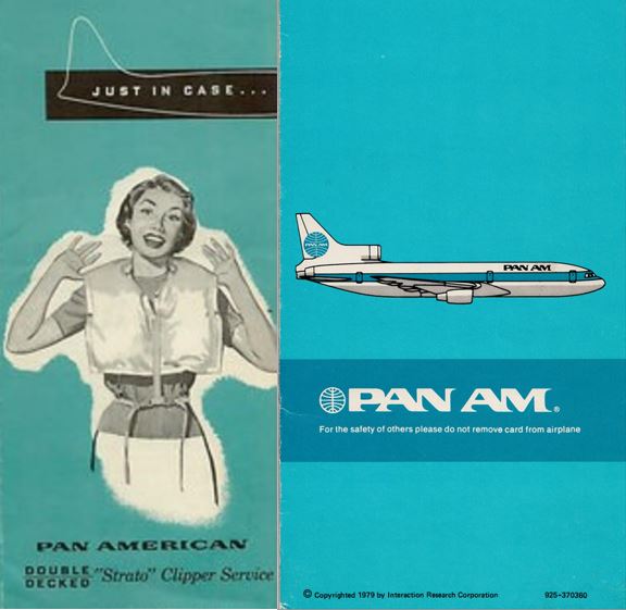
Neither Beau nor Daniel were artists, so they hired illustrators for drawing the pictorials. Unintentionally, they thus created a pool of professionals who later started on their own. This explains why today there are quite a few safety card making companies in the state of Washington. At one stage, Beau Altman had its own company. I reproduce the 1988 Air Ontario Convair 580 card. Note the tagline: For Your Safety, not trade marked.
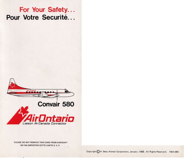
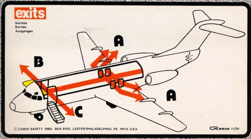
On the East Coast, male flight attendant and vivid collector of safety cards – probably holding the world record in number of unique samples – Carl Reese, was an artist himself and started in 1981 a one-man safety card producing company. He named it Cabin Safety Inc., trademark Cabin Safety. His garage was his own home in Lester, PA, near Philadelphia. After having lived for a while in nearby, quiet Cecilton, MD and renaming his company as Cabin Safety International, he emigrated to Calgary, Canada. Readers of the Captain’s Log will recognize his name, or may even have met and traded with him. He ran the Log’s safety card section in the 1980s and often visits Airliners InternationalTM conventions. An early safety card of his hand is for Altair’s Fokker F-28, drawn November 1981. Carl also tested his drawings on naïve subjects, but not at the same scale as IRC.
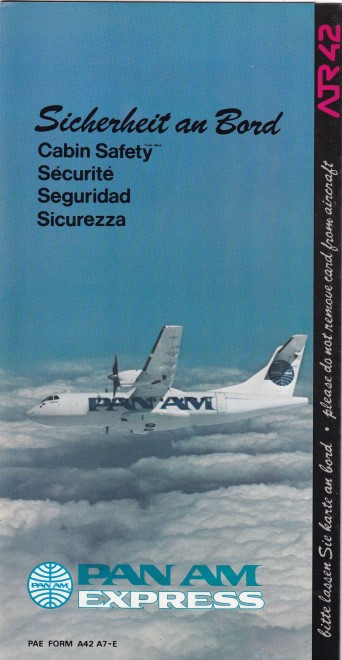
Whereas IRC mainly served large airlines and heavier equipment, Carl’s clientele primarily consisted of smaller airlines and private operators, with associated lighter aircraft. Where Pan Am used IRC, Pan Am Express (formerly Ransome Airlines) used Cabin Safety. Its ATR42 flew routes both in the USA and, before the wall fell, between West Germany and Berlin. For the latter, Carl made a version with German as primary language.
Regulatory Actions
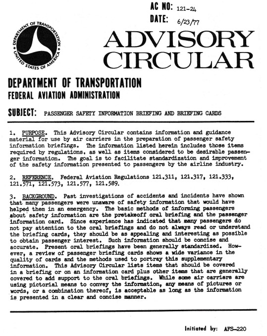
The 1970s’ spike in survivable, yet fatal accidents caused concern with the US congress. Its members, coming from all of the US states for meetings in Washington, D.C., were frequent flyers and could well relate to it. The House of Representatives organized a series of hearings aimed at improving cabin safety, occurring almost annually between 1976 and 1990. In July 1977, the focus was on passenger education. Witnesses interviewed included a survivor of the 1974 Pago Pago crash and Beau Altman and Daniel Johnson. For those interested, search for: Aviation Safety: Aircraft Passenger Education, the Missing Link in Air Safety : Hearings Before the Subcommittee on Investigations and Review of the Committee on Public Works and Transportation, U.S. House of Representatives, Ninety-fifth Congress, First Session, July 12, 13, and 14, 1977. Coincidently or not, the FAA had published just a few weeks before its first set of guidelines for briefing cards: FAA Advisory Circular (AC) No. 121-24. These guidelines augmented the requirements in force since the previous decade. The entire AC can be found on page 118 of the NTSB 1985 Special Study on Airlines Passenger Safety Education (https://www.ntsb.gov/safety/safety-studies/pages/ss8504.aspx).
Both the SAE ARP and the FAA AC set standards for what to present in the cards. Both said that ‘the primary method of presentation should be pictorial’. This accelerated the trend of going away from text and use graphs instead. The list of subjects to be explained does not contain any surprises:
- exits/slides/oxygen/seatbelts/brace positions/individual flotation devices.
Additionally, for extended overwater operations:
- exit awareness and location/life preservers/life rafts, slide rafts/emergency locator transmitters (ELT)/survival equipment.
Note that both the exit awareness and location and the ELT guidance was limited to the overwater operations section. This is strange as they would equally apply to overland flights. This was corrected in later updates. The AC also addressed the briefings by flight attendants to passengers, including handicapped passengers. Both the ARP and the AC exist today, updated with many subjects added since the original version, as we will see in the next part of this series.
Comparison
Comparing 1970s and 1980s cards to the ARP and AC reveals some interesting facts.
In many cases, airlines covered more subjects than the minimum prescribed. Often, emergency equipment and their locations were displayed even though not prescribed. This also applied to equipment that should not be used on board, such as radios, television sets and cigarette lighters. It was not uncommon to show passengers the crash axe in the rear of the cabin, as Avianca did on their 707. Would they still do that today? Remember, these are the 1970s and 1980s.

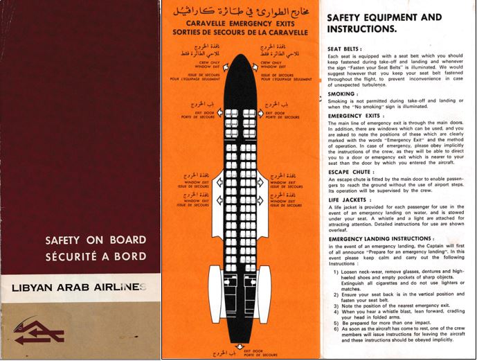
Some 1970s cards still had the emergency landing preparation instructions that were en vogue in the 1950s, instructing passengers to remove glasses, sharp objects and much more. See the sample taken from the Libyan Arab Airlines (LAA) Caravelle leaflet. Libyan Arab Airlines was the new name of Kingdom of Libya Airlines, following the coup in late 1969 by Muammar Gadaffi which ended the monarchy. This leaflet likely dates from 1970 or soon after.
The 1970s saw the phrase “Do not remove from the aircraft,” “Leave on board,” or similar messages gradually appear on more and more safety cards. It is believed that smaller airlines, with lower budgets, started with this, possibly in an attempt to stop having to replenish whole loads of cards after each flight. Larger airlines then took up this practice as well and today it will be hard to find a card without such a text. It is believed that IRC, whose business was to sell cards to airlines, initially only used the phrase when their customers so specified. Cabin Safety had it from their start in 1981.
Both card makers diligently met all the recommendation of the ARP and AC. The only item they typically added that was neither on the ARP nor the AC were instructions for the stowage of hand luggage and the seat back table.
Some airlines that had long stretches over water were late with including instructions for evacuation on water and the use of life rafts. Lufthansa did not have separate water evacuation panels, but showed the use of life rafts or slide rafts where so equipped. The original Laker Airways, which was British and became famous for their no-frills, very cheap “Skytrain” flights between London and New York from 1977 until 1982,only showed life vests and nothing else that would facilitate a ditching evacuation.
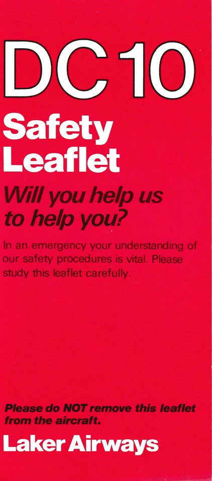
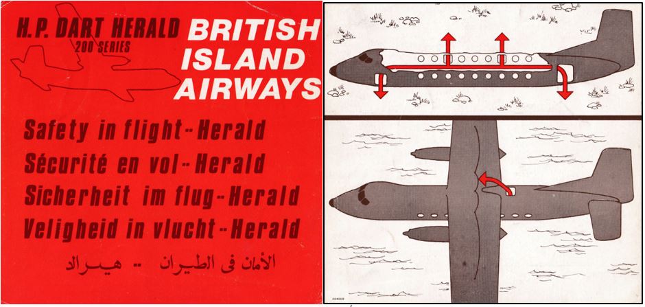
(The later US Laker Airways also used DC-10s and had cards made by IRC, with ditching instructions). Conversely, British Island Airways, which flew the high-winged Dart Herald only a short sector over water between England and the European continent in the 1970s, did show on their cards how to evacuate on water: via the roof of the aircraft and with ropes attached to the wings to hold onto once outside!
In the next part, I will cover the trends in safety cards in the period 1990 to now.
Fons Schaefers / August 2023
Email: f.schaefers@planet.nl
Tags: History, Safety cards
Trackback from your site.

Lester Anderson
| #
Great detail of the next generation of safety cards. Thank you.
Reply